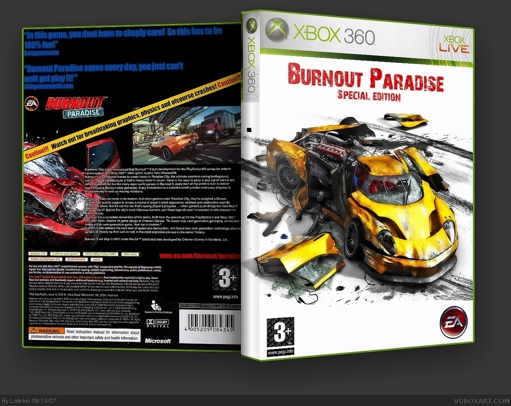
The front looks superb. The back not so much. it seems as though it should be white like the front, and the blue font kinda brings it down a bit, but it's pretty good. i'll say a high 3/5. if you fix the back up it would be a 5 box.
#2, Um I think the other way. Front is toooo bland and text is not very good. Back also has a bland background but it looks quite nice. 2.5/5 but maybe 3 or 4/5 if u fix front
 Burnout 5 Box Cover Comments
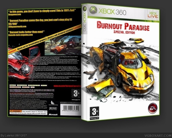
Look's like quality goes pretty low after upload :(
But anyway, please leave a comment! ;)
[ Reply ]
The front looks superb. The back not so much. it seems as though it should be white like the front, and the blue font kinda brings it down a bit, but it's pretty good. i'll say a high 3/5. if you fix the back up it would be a 5 box.
[ Reply ]
Ver 2 is out! Comments please!
[ Reply ]
#2, Um I think the other way. Front is toooo bland and text is not very good. Back also has a bland background but it looks quite nice. 2.5/5 but maybe 3 or 4/5 if u fix front
[ Reply ]
It's good, but the EA logo on the front looks... odd...
[ Reply ]
#5, Well...don't blaime me. It's official Logo. And, quality goes low after uploading here.
Edited at 1 decade ago
[ Reply ]