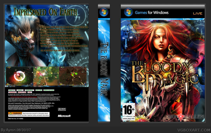
ok, it's been a long time since i've submitted a box, and i've done my utmost on this one, please do not view in Full view, and don't try to read the text, the template was too small,but i liked it.x]
Any flaws appointed to me might be solved when the time comes.
about the game, it's a upcoming game by Skyfallen, russian i guess, and has several names:Dawn of magic,Blood magic and The bloody magic.
Anyway, i hope you like it.
comments are appreciated.
#6, come on man, I think ayron has been improving all this time. this is good, I suggest to have a better screenshot arrangement (optional) but should definitely either eliminate the line on the side of the back text or reduce it's opacity. I saw it on destined's box, but could have the same cool effect here if you can fix it. Great job
#4 ty;)
#6 lol o.o'
#7, thanks dude. i'll try to update today.
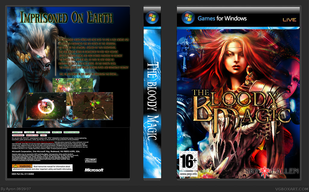
what do you guys suggest i should do to the screenshots?
And credit to CMT for temp, i forgot whose it was.
#10, thanks alot DMS, i appreciate it ^^.
And i've always been better at fronts than backs, way too many requirements for backs;).
Anything to improve on the box?
This is pretty good, and the front seems nice, but the logo looks a bit rugged. I also cannot read the text at the back, and the back info too, overall pretty good job tho. 3/5
#14, thanks, the logo was like that too, and the back info, well, sorry,but i can't fix it.
the back text is ,as i mentioned before,too small because of the template, couldn't fit it in. sorry.
 The Bloody Magic Box Cover Comments
ok, it's been a long time since i've submitted a box, and i've done my utmost on this one, please do not view in Full view, and don't try to read the text, the template was too small,but i liked it.x]
Any flaws appointed to me might be solved when the time comes.
about the game, it's a upcoming game by Skyfallen, russian i guess, and has several names:Dawn of magic,Blood magic and The bloody magic.
Anyway, i hope you like it.
comments are appreciated.
[ Reply ]
:O waw its really nice dont like the spine though 4/5
[ Reply ]
#2, what can i improve about it, because leaving it dark-black is really ugly.;)
nice avatar btw.
[ Reply ]
My only complaint is you could have better positioned the screenshots.
Besides that it looks great.
[ Reply ]
credit to me for the temp :)
[ Reply ]
Hey, Ayron improved.
[ Reply ]
#6, come on man, I think ayron has been improving all this time. this is good, I suggest to have a better screenshot arrangement (optional) but should definitely either eliminate the line on the side of the back text or reduce it's opacity. I saw it on destined's box, but could have the same cool effect here if you can fix it. Great job
[ Reply ]
#4 ty;)
#6 lol o.o'
#7, thanks dude. i'll try to update today.
what do you guys suggest i should do to the screenshots?
And credit to CMT for temp, i forgot whose it was.
[ Reply ]
Update!
added A couple of Arcane circle brushes i had lying around and fixed some flaws.
hope you like it!
[ Reply ]
This is very nice. I especially like the front! great job! :)
Edited at 1 decade ago
[ Reply ]
#10, thanks alot DMS, i appreciate it ^^.
And i've always been better at fronts than backs, way too many requirements for backs;).
Anything to improve on the box?
[ Reply ]
You changed the screenshots! Looks better now, faved it also ;) Great job on the front!
[ Reply ]
#12, thanks alot, seems at least someone checked this box since the update ^^
[ Reply ]
This is pretty good, and the front seems nice, but the logo looks a bit rugged. I also cannot read the text at the back, and the back info too, overall pretty good job tho. 3/5
[ Reply ]
#14, thanks, the logo was like that too, and the back info, well, sorry,but i can't fix it.
the back text is ,as i mentioned before,too small because of the template, couldn't fit it in. sorry.
[ Reply ]
Yeah, it looks better now that re-situated the screenshots:D
[ Reply ]
#16, thanks, i agree ^^
[ Reply ]