to the Nooby McNofriends who stole my original box, don't bother commenting because you're just a low-life box-stealing ass-clown.
I decided to edit the box so there wasn't two of the same thing on the site. Personally, I think this one looks much better. So don't bother commenting on the stolen one, comment on this one instead. and maybe favourite it. j/k.
i made this box months ago, as most of you have heard. so don't go accusing me of stealing something of my own creation. lolz
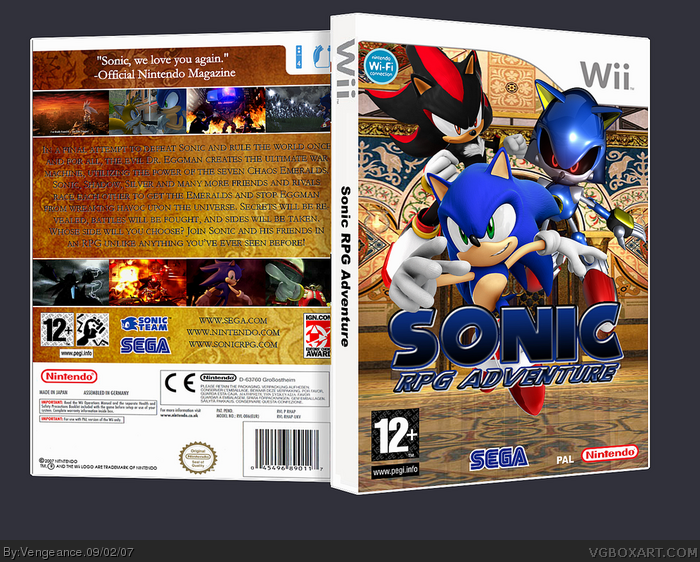
its all good except i really don't think that metal sonic fits in... he sticks out -- in a bad way and its a bit bothersome.
other then that and the back text is a bit hard to read it's fine.
btw, is there really even an "official nintendo magazine" ? the one here is nintendo power but you might not get that in europe.
Wow...this is really good. The only thing I'll say is that toward the left side of the back, the text is a bit hard to read because the background is darker than the right side of the back.
 Sonic RPG Adventure Box Cover Comments
to the Nooby McNofriends who stole my original box, don't bother commenting because you're just a low-life box-stealing ass-clown.
I decided to edit the box so there wasn't two of the same thing on the site. Personally, I think this one looks much better. So don't bother commenting on the stolen one, comment on this one instead. and maybe favourite it. j/k.
i made this box months ago, as most of you have heard. so don't go accusing me of stealing something of my own creation. lolz
Edited at 1 decade ago
[ Reply ]
wow now this is cool
[ Reply ]
This is really cool but I can barrrely read the text on back. Maybe change the colour. Welcome back :D
[ Reply ]
#3, it's better than that crappy white text
[ Reply ]
Awesome box.
[ Reply ]
great box realy is awsome
[ Reply ]
Very nice my friend, very nice.
[ Reply ]
whoops, forgot the credit Timmeh for the logo, lol
[ Reply ]
Great stuff, old chap.
I'd suggest adding a slight drop shadow to the text on the back cover and its good to go to the hall.
[ Reply ]
i love it
5/5 +fav
[ Reply ]
Good job buddy!
[ Reply ]
its all good except i really don't think that metal sonic fits in... he sticks out -- in a bad way and its a bit bothersome.
other then that and the back text is a bit hard to read it's fine.
btw, is there really even an "official nintendo magazine" ? the one here is nintendo power but you might not get that in europe.
[ Reply ]
#12, there is an official nintendo magazine over here, i think it's called that, it might be Nintendo Power idk
also, is it that you metal sonic is sticking out over the template? I got that idea from you, y'know
Edited at 1 decade ago
[ Reply ]
#4, not really imo.
nice box Vengeance, good to have you back.
[ Reply ]
wow! i hate sonic and i rate the boxes bad but this is butiful and makes sonic games look good. this is the best sonic box iv ever seen. 5/5
[ Reply ]
Yay! I can favorite this one!!! I love it!!!
5/5
[ Reply ]
this turned out great! nice work, fav
[ Reply ]
FAV Look out for my prince of persia collection for the ps3 im posting tonight.
[ Reply ]
this deserves to be halled of fammed
[ Reply ]
Wow...this is really good. The only thing I'll say is that toward the left side of the back, the text is a bit hard to read because the background is darker than the right side of the back.
[ Reply ]
This is pretty nice, I like the logo as well.
[ Reply ]
#13, it kinda bothers me though,the sticking over the template.
[ Reply ]
#18, don't advertise your box on mine, kthanks.
[ Reply ]
Hey Vengeance! if you hate Metal Sonic so much, why is he on this box hehehe xD
+fav btw.
[ Reply ]
#24, XDDDDDDDDDD
[ Reply ]