I like this, very good. Barcode at the top...weird.
I never liked that creature on the front. It looks like it belongs in 'Dark Crystal' or 'Labyrinth'.
i have to say this is really nice the only fault is the headline on the back isn't so fitting or visible.
also, i'm kinda antsy about this but ntsc/pal region code boxes really do make boxes look more complete.
great, i just don't like how marcus isn't the center of attention on the front. he's the main character, and should be more noticeable than everyone else. it looks like dom's the main character.
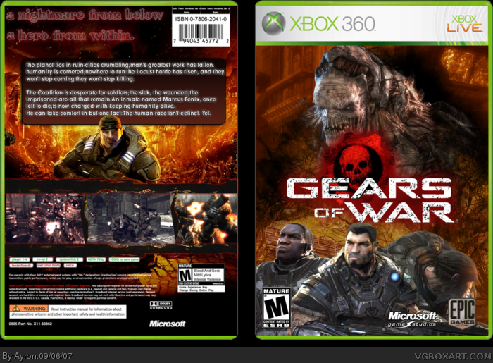
 Gears of War Box Cover Comments
ok, my GOW box. i deleted it the first time, needed a big update.
hope this is better.
[ Reply ]
CREDIT ME!!! AHHHH!!!
LOL anyway, it's MUCH better. Keep up the awesome shit! xD
[ Reply ]
I like this, very good. Barcode at the top...weird.
I never liked that creature on the front. It looks like it belongs in 'Dark Crystal' or 'Labyrinth'.
[ Reply ]
#2, sorry, i forgot in the second post.
Cred to Elcrazy for Temp.
Thanks #2-3
[ Reply ]
no ! no! no! why is marcus turning round? when theres two pics of people with faces showing, put a pic of marcus showing his face, not turning.
4/5 change that then Fav + 5/5
[ Reply ]
#5, i think he saw a girl walking by.
be sure to check for updates ;]
[ Reply ]
:DLol!!
[ Reply ]
i have to say this is really nice the only fault is the headline on the back isn't so fitting or visible.
also, i'm kinda antsy about this but ntsc/pal region code boxes really do make boxes look more complete.
[ Reply ]
#8, hmm, k.ty.
what do you mean, 'feel complete?'
[ Reply ]
great, i just don't like how marcus isn't the center of attention on the front. he's the main character, and should be more noticeable than everyone else. it looks like dom's the main character.
[ Reply ]
#10, yeah k.
when i get photoshop fixed, i'll update.
[ Reply ]
Impressive!
[ Reply ]