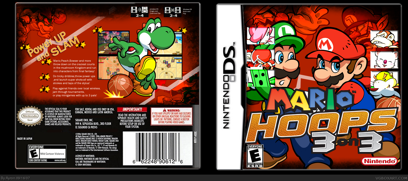
#3, -sigh-, he's not yellow.
if you'd look closely, he's just lighter. but'i'll fix those two things.
does anyone know where to find a Cartridge template?
This is really good Ayron!
One of your best yet, just one minor thing wrong(to me) and that is the text on the back is a little small.
Besides that awesome job.
Wow seriously they need to set up a freaking system all ready to fix this problem. What if everyone has a rating and if you get to many negative ratings you get banned until Reed or another mod have enough to time check into it and see if your going to be banned or forgiven and warned.
I love the box A LOT! looks really good. There is 1 thing i would say i don't like and that is how on the back template it has like a white glow on the right and the rest doesn't. If you fix that i will fav it.
oh yeah and on the left line thing across the back there is a little square missing on it. Fix that to.
Send me a IM or AIM or a message and i will send you a better back template i made.
This is pretty sleek. I think it'd improve it if you got rid of the SSB style character boxes that clutter it up a bit, make the synopsis font size a bit bigger, and make the MH logo a bit smaller.
 Mario Hoops: 3 on 3 Box Cover Comments
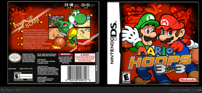
My Mario hoops,3 on 3 box.
this really took alot of work, and i hope you guys like it.!
comments are appreciated.
Credit to CruSaDer for Temp[right?]
[ Reply ]
Really nice!
I'm not so keen on the boxes covering part of Luigi's face though.
[ Reply ]
why is Bowser Jr. Yellow ?
[ Reply ]
#3, -sigh-, he's not yellow.
if you'd look closely, he's just lighter. but'i'll fix those two things.
does anyone know where to find a Cartridge template?
[ Reply ]
update!
fixed the flaws pointed out to me.
[ Reply ]
That's better!
[ Reply ]
I totally love the back, but there's something bugging me about the front.
But overall, great job dude! :)
[ Reply ]
No.... i don't like it! it's very hard to read the title....especially the word 'on'!
My box is better...so follow my example
Edited at 1 decade ago
[ Reply ]
#8, As I said before, Satan laughs as you eternally rot, you piece of shit.
[ Reply ]
Stop it! You make me crying
Edited at 1 decade ago
[ Reply ]
lol @ #8. ty elcrazy.
[ Reply ]
#10, I make your crying? WTF is wrong with you man? You're such a wuss.
[ Reply ]
#12, Satan laughs as you eternally rot, you piece of shit.
and.....please take a look @ my briliant box!
Edited at 1 decade ago
[ Reply ]
#13, please stop spamming my box,
and elcrazy, take it easy, he's not worth your time and the risk at being banned.
[ Reply ]
EDITED. Okay I'm sorry.
Edited at 1 decade ago
[ Reply ]
This is really good Ayron!
One of your best yet, just one minor thing wrong(to me) and that is the text on the back is a little small.
Besides that awesome job.
[ Reply ]
#16, thanks RR, i might make it 2 or 3 bigger ;)
[ Reply ]
Wow seriously they need to set up a freaking system all ready to fix this problem. What if everyone has a rating and if you get to many negative ratings you get banned until Reed or another mod have enough to time check into it and see if your going to be banned or forgiven and warned.
I love the box A LOT! looks really good. There is 1 thing i would say i don't like and that is how on the back template it has like a white glow on the right and the rest doesn't. If you fix that i will fav it.
oh yeah and on the left line thing across the back there is a little square missing on it. Fix that to.
Send me a IM or AIM or a message and i will send you a better back template i made.
Edited at 1 decade ago
[ Reply ]
#18, white glow?
thanks Trev, but i don't see the white glow.
Could you PM me the back temp?.
ty.
Edited at 1 decade ago
[ Reply ]
This is pretty sleek. I think it'd improve it if you got rid of the SSB style character boxes that clutter it up a bit, make the synopsis font size a bit bigger, and make the MH logo a bit smaller.
[ Reply ]
#20, k, i'll try to update it asap.
thanks ;)
[ Reply ]
Btw, i won't be able to update untill tomorrow-night i guess. but it'll be worth it, i hope.
Stick around^^
[ Reply ]
Nice but im not a big fan of mario...
[ Reply ]
#23, ITSA MARIOOO x] roflmao.
they should make new characters...T.T
thanks haji.
[ Reply ]
Anyone? T.T
[ Reply ]
Pretty good! 4.5/5
[ Reply ]
Edited at 1 decade ago
[ Reply ]
UPDATE!
hope you like it better now.
[ Reply ]
Anyone?
[ Reply ]
Love it. +fav
[ Reply ]
DAYMNN, ayron. this is nicccceeeee +fav
[ Reply ]
To be honest with ya, it looks like Mario is sexually-assaulting Luigi with his hands behind the logo...
[ Reply ]
#32, =.= omg?
Thanks #30-32. ^^
[ Reply ]
Great stuff
[ Reply ]
#34, thanks blink, that's an amazing compliment coming from you x].
[ Reply ]
Nice update, it'd be swell if the MH logo wasn't so choppy in full size though.
[ Reply ]
#36, yeah, sorry 'bout that. that was the only good logo i could find.
[ Reply ]
Thanks everyone For +faving and commenting ^^
[ Reply ]
Really nice
[ Reply ]