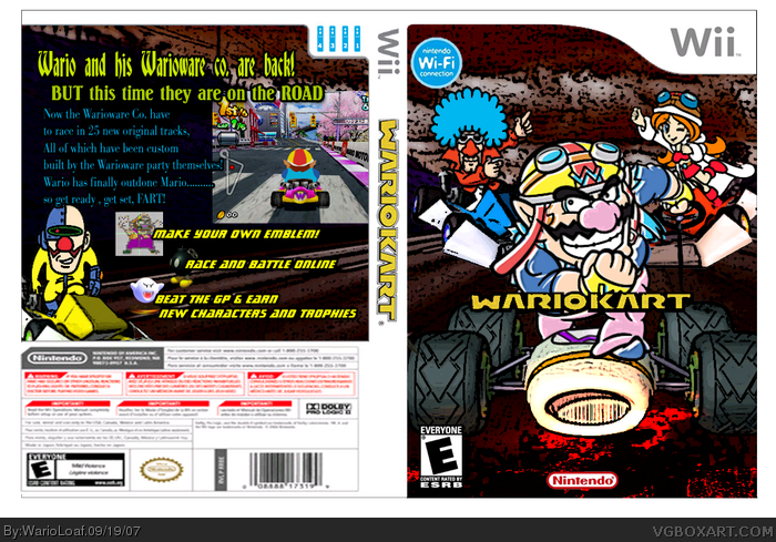
that is very good except the back template is really blurry. also, the top wii remote icons should be deleted except the one with "4" on it. and move the wifi connection to the right and up a little. i would move the nintendo dev logo all the way to the right as well. other than that, you did a great job. 4/5
 Wario Kart Box Cover Comments
Yup, that "Wario Kart" logo on the front cover is meant to look a little ragged and cut bad. Oh and this i made cause i was board ;)
[ Reply ]
that is very good except the back template is really blurry. also, the top wii remote icons should be deleted except the one with "4" on it. and move the wifi connection to the right and up a little. i would move the nintendo dev logo all the way to the right as well. other than that, you did a great job. 4/5
Edited at 1 decade ago
[ Reply ]
look like fun
[ Reply ]
i like wario its good
[ Reply ]
nice it would be better then mario kart
a 5 out of 5
[ Reply ]
I would buy this! 3.8 out of 5
[ Reply ]