Also, you forgot that Ubisoft Montreal said that as part of a trilogy, the first assassin's creed would be the only one in the past, and that the next two would be in the future. also, this should be quite obvious since at the end of assassin's creed, they say that they have what they need. also, the hundred years' war had NOTHING to do with the crusades, as the crusades were over. The logo is nice. also you didn't make it for the ps3, and that's a mistake in and of itself...
hey lord of crows i think it is amazing and it doesnt matter it is the creativity that counts and i think it is awesome lets see you do something that is better i think not...
 Assasins Creed 2 Box Cover Comments
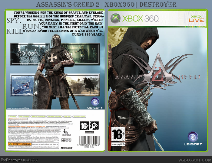
thanks to PN18 for the logo I'll robably make a back it please you.
Edited at 1 decade ago
[ Reply ]
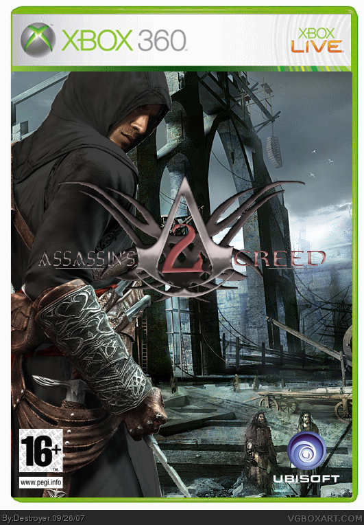
Nice! but the little people throw me off. :P
Also. I didn't know you were going to use a dark Bg so here! ^_^
link
I made it lighter.
Please make a back! 4/5
Edited at 1 decade ago
[ Reply ]
Pretty cool one.
[ Reply ]
Not too bad, but please use these suggestions.
-Use the Matting technique to remove the thin white line surrounding Altair.
-Have a colour theme, because Altair does not blend in good.
[ Reply ]
#4, OK, I agree. I'll do that.
[ Reply ]
I hope it's better
[ Reply ]
You spelt Crusades wrong.
[ Reply ]
#7, lol that's don't really mater...
[ Reply ]
Besides the fact that you spelled crusade wrong, its good. 5/5 +fav
[ Reply ]
#9, thanks :p
[ Reply ]
i like that recolour you did on Altair, the rest is only OK though.
Edited at 1 decade ago
[ Reply ]
Tell me you colored him black because if you did thats sweet.
[ Reply ]
#12, Only thing he did was use selective color in photoshop
[ Reply ]
So? It looks good.
[ Reply ]
#12 lets see you do it then. I don't see you being that creative on your boxes.
[ Reply ]
#15, You see your talking to yourself right
[ Reply ]
i meant #13
[ Reply ]
that rocks l lov assassin
[ Reply ]
The black Altair is on deviantArt. He got it from there I suspect.
Oh and nice box, but the font on the back does not fit at all. Change the font and make it silver or something red
Edited at 1 decade ago
[ Reply ]
the words on the back dont fit well together - the spy, kill, run don't look good there mixed in with the other text...
#19 is right, the font isn't good. the rest is amazing thou, almost a perfect 5 =)
[ Reply ]
Also, you forgot that Ubisoft Montreal said that as part of a trilogy, the first assassin's creed would be the only one in the past, and that the next two would be in the future. also, this should be quite obvious since at the end of assassin's creed, they say that they have what they need. also, the hundred years' war had NOTHING to do with the crusades, as the crusades were over. The logo is nice. also you didn't make it for the ps3, and that's a mistake in and of itself...
[ Reply ]
awesome
[ Reply ]
brilliant 5/5 +fav
[ Reply ]
Nice 100/100 Fav for sure
[ Reply ]
hey lord of crows i think it is amazing and it doesnt matter it is the creativity that counts and i think it is awesome lets see you do something that is better i think not...
[ Reply ]
thanks you, how to DL your cover ? pleased answer me.
[ Reply ]