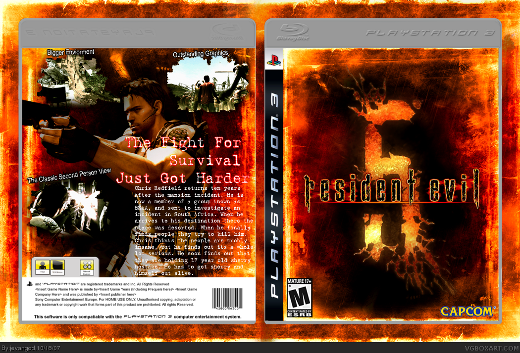
My tip is to make Chris a little more blending to the pattern you have used on both the front and the back. He kinda sticks out a tad too much. And the text could be smaller and a little more to the right. But this is still worth my fav.
BTW: Why not making a ce edition? When I saw the front I at the instant thought to myself "That looks like a concept they would have used on a ce version of this game". It just feels so exclusive.
#19, Why not just making it into a thick box with the material they used on the World of Warcraft boxes from the beginning. And finding a good font is not in my opinion the reason to give up. I think this box would certainly become a HoF if you just tried to find that CE font. :)
#20, Im not talking about the thick box and all that im talking about the font I couldnt find a good font and even if I did it would take forever to get the gradient overlay right
#22, If you had photoshop 7.0 youd understand its a color over lay for the font like half of the text could be black and the other half could be black or any color I want it to be
#23, Yeha I know what a gradient is, I've used them myself you know. What I didn't understand was "What gradient overlay?". I don't see anyone when just looking.
EDIT. If you want to do a gradient overlay on a text, it's just to use layereffects. That's how I've done gradient overlays on texts that is.
#31, No im saying I know you can do way better cause the way you know ow to make boxes better on other peoples boxes you should be able to do that to yours. Its a compliment
#35, I actually used one of these resident evil pictures I found on photobucket and I had o change the color and that that stuff and make it look like fire it took a long time. But I saved the picture
 Resident Evil 5 Box Cover Comments
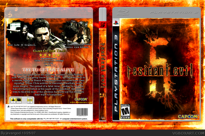
Sirry for deleting the last one it wasnt finished I forgot I thought I fifnished it last night. I guess I was dreaming. Well here it is finished
[ Reply ]
the front is amazing. the back....not so much, but it's still good.
[ Reply ]
Awesome.
[ Reply ]
Now it's amazing. Definitely fav-worthy and probably your best box.
[ Reply ]
Thanks everyone
[ Reply ]
Really nice. My only gripe is that the text should have a 1px stroke, as it looks subdued by the image.
[ Reply ]
*Favs*
[ Reply ]
It's pretty cool but the description gets lost on the back, you should probably give it a small stroke or a drop shadow.
[ Reply ]
#8, Yea I was going to do that at first but I forgot
[ Reply ]
fucking cool as hell
[ Reply ]
Thaks for the comments and favs everyone
[ Reply ]
What could I do to make the back better
[ Reply ]
Upgraded.what do yall think of it now?
[ Reply ]
#13, that back looks much better. 5/5 + fav
[ Reply ]
#14,Thanks I put alot of work into it last night
[ Reply ]
#14,Thanks I put alot of work into it last night
[ Reply ]
Updated
[ Reply ]
My tip is to make Chris a little more blending to the pattern you have used on both the front and the back. He kinda sticks out a tad too much. And the text could be smaller and a little more to the right. But this is still worth my fav.
BTW: Why not making a ce edition? When I saw the front I at the instant thought to myself "That looks like a concept they would have used on a ce version of this game". It just feels so exclusive.
[ Reply ]
#18, This was meant to be a collectors edition at first but I couldnt get a good text to go with it on the front
[ Reply ]
#19, Why not just making it into a thick box with the material they used on the World of Warcraft boxes from the beginning. And finding a good font is not in my opinion the reason to give up. I think this box would certainly become a HoF if you just tried to find that CE font. :)
[ Reply ]
#20, Im not talking about the thick box and all that im talking about the font I couldnt find a good font and even if I did it would take forever to get the gradient overlay right
[ Reply ]
#21, Gradient overlay? Now I'm not following you... :S
[ Reply ]
#22, If you had photoshop 7.0 youd understand its a color over lay for the font like half of the text could be black and the other half could be black or any color I want it to be
[ Reply ]
#23, Yeha I know what a gradient is, I've used them myself you know. What I didn't understand was "What gradient overlay?". I don't see anyone when just looking.
EDIT. If you want to do a gradient overlay on a text, it's just to use layereffects. That's how I've done gradient overlays on texts that is.
Edited at 1 decade ago
[ Reply ]
#24, And what program do u use?
[ Reply ]
#25, Elements 4, CS2/3. These past weeks I've been using Elements, whereas my most recent box where done in CS3.
[ Reply ]
#26, You should get photoshop its alot better
[ Reply ]
Edited at 1 decade ago
[ Reply ]
#27, Uhh, it IS Photoshop. I've always used photoshop...
[ Reply ]
#29, Oh well I thought your boxes would look alot better. Cause if you have that man you should be making crazy good boxes.
[ Reply ]
#30, Uhh, how am I supposed to take that, like you think all of my boxes are completely suckish?
[ Reply ]
#31, No im saying I know you can do way better cause the way you know ow to make boxes better on other peoples boxes you should be able to do that to yours. Its a compliment
[ Reply ]
#32, Yeah I know. but my comp's been whacked for some months now, so I haven't been able to update my skills during those days.
Btw, how did you do the pattern on the front, always wanted to do that. :D
[ Reply ]
#33, What do you mean pattern?
[ Reply ]
#34, Basically how you made that 'cracking-fire' look on the front.
[ Reply ]
#35, I actually used one of these resident evil pictures I found on photobucket and I had o change the color and that that stuff and make it look like fire it took a long time. But I saved the picture
[ Reply ]
#35, brushes,stuff like that,i can make a lot of cool things if you have brushes.
[ Reply ]
#36, did you see my box.
[ Reply ]
#38 please dont advertise youre own boxes
[ Reply ]
#38, What box?
[ Reply ]
#37, Its hard to make this with just brushes. I took the easy way but it took about 2 hours to get the lava right
[ Reply ]
Im going to try one more time to make a back for this game and I promise it will be great to go with the front
Edit: Does anyone have a better template I could put it on
Edited at 1 decade ago
[ Reply ]
Upgraded what do you guys think. It took a long time to do this. I like the back alot more than the other one I made. What do yall think?
[ Reply ]
Sorry about uploading the other one well here it is.
[ Reply ]
Thanks for the 3 extra favs Nerdysimmer, Pandom, Tikicobra
[ Reply ]
double post sorry
Edited at 1 decade ago
[ Reply ]
27/47 are the author's posts..
[ Reply ]
#47, Wow you brought back my old box just to say that
[ Reply ]
This is amazing. The design is clean, grundgy, and all around well designed.
[ Reply ]
My ass
Where's my ass ?
This box just kicked my ass !
[ Reply ]
Fan-fricking-tastic.
[ Reply ]
Thanks
[ Reply ]
Oh mah golly, just one more fave.
[ Reply ]
well done!:)
[ Reply ]
kewl it went into the HOF I didnt even know thanks for the comments and favs everyone
[ Reply ]
Whoops double post
Edited at 1 decade ago
[ Reply ]
#1, Dude im new at this and i was just wondering.......How do you create Box Art
Edited at 1 decade ago
[ Reply ]
Jevan, another awesome job. Saw this one couple of times before, and I love the lava scheme.
The front's awesome, though the text on the back is kinda eh-eh.
But awesome job. 5/5.
Btw, the lava scheme, is it made by you?
[ Reply ]
Nice front cover dude! I'm afraid to touch it as it looks as if it will burn me! :D
[ Reply ]
R.I.P jevan...
+fav out of respect ... *moment of silence*
[ Reply ]