1 critical remark: I think you should shift all the signature up a bit (with the frames) because they look at bit close to the bottom/copyright section.
this is nice..just a couple little things. first, the M on the front should be a little bigger and the right a little bit more. and the frames on the back look out of place because it dusnt match the colour scheme you have.
so just cuz of those little things, 4.5/5
 Army of Two Box Cover Comments
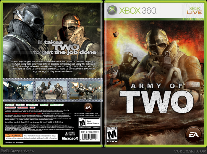
My second HoF hopeful! The front is similar to my previous AoT one, but there are many changes.
YEAYA!
MUST VIEW IN FULL! RESIZING KILLS IT!
Edited at 1 decade ago
[ Reply ]
HOLY CRAP!
A HUGE improvement on your previous Army of Two box!
+fav!
*Edit* - Now I see why you needed to know about that font =)
Edited at 1 decade ago
[ Reply ]
Thanks dude
[ Reply ]
dude this is crazy awesome. faved
[ Reply ]
Awesome. 5/5.
[ Reply ]
1 critical remark: I think you should shift all the signature up a bit (with the frames) because they look at bit close to the bottom/copyright section.
[ Reply ]
Thanks guys.
And I'll work on that tomorrow, thanks :)
[ Reply ]
I love you.
[ Reply ]
#8, Hmmmm....yeah, I love myself too. :p
lol.
[ Reply ]
Haha... Seriously, though, amazing box.
[ Reply ]
Great job homeboy, great job.
[ Reply ]
Holy shat dude....when did you get so friggin' good? + Fave.
[ Reply ]
I dislike the bordors but everything else is good!
[ Reply ]
HAHA thanks guys! :)
#12, With taking advice from others, yeah, that's how ;)
Edited at 1 decade ago
[ Reply ]
Nice i like it a lot.
[ Reply ]
I think it would look a little better if you used the AoT EA logo.
[ Reply ]
this is nice..just a couple little things. first, the M on the front should be a little bigger and the right a little bit more. and the frames on the back look out of place because it dusnt match the colour scheme you have.
so just cuz of those little things, 4.5/5
[ Reply ]
#16, It's quite hard to cut it out, and it wouldn't fit the theme here.
[ Reply ]
nice one
[ Reply ]
HAHA thanks.
[ Reply ]
WOW! Nice job dude. The back really gets r' dun! FAV+
[ Reply ]
wicked, but why is the EA logo looking so brown?
[ Reply ]
#22, He pooped on it.
[ Reply ]
#23, that seems reasonable.
[ Reply ]