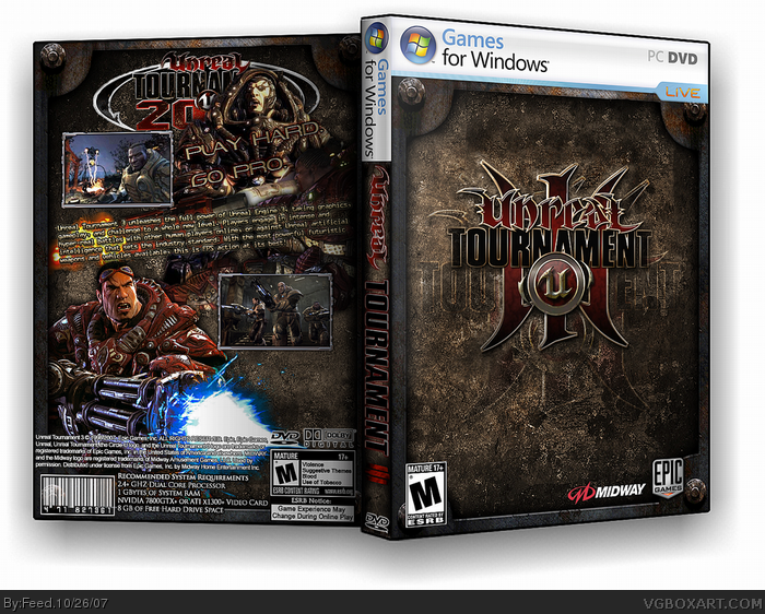
I just don't like it...it's too plain. I don't like how you've overlayed the logo behind the logo, and fitting your image to a 3D template has made the back images and text choppy and slightly unreadable. Also, I don't think the guy on the back should be covering up the logo on the back.
#2, let's not get too carried away ;)
anyway, yea the box rulez, much. did you make the logo? it looks like....well something amazing lol. the only flaws I really see are the guy covering up the logo which should be the official or the one on the front. and the small text on the back. fix those and the box will be pwntastic to the max =D
holy crap this is awesome. but i'm gonna have to agree with the logo on the back, it shouldn't be there anyway because it says UT2007 and you can only see half of it.
Wow, the things you find when you are simply browsing the web. Nice that the author used my logo, but failed to ask for permission to use the it. Too bad I rarely ever get credit for my work, and it did not happen in this case.
 Unreal Tournament 3 Box Cover Comments
Play hard. Go pro.
[ Reply ]
JESUS TAP DANCING CHRIST, THIS IS THE BEST PC BOX ON THIS SITE YET
Edited at 1 decade ago
[ Reply ]
Nice 5/5.
[ Reply ]
Oh my....
[ Reply ]
I just don't like it...it's too plain. I don't like how you've overlayed the logo behind the logo, and fitting your image to a 3D template has made the back images and text choppy and slightly unreadable. Also, I don't think the guy on the back should be covering up the logo on the back.
[ Reply ]
#2, let's not get too carried away ;)
anyway, yea the box rulez, much. did you make the logo? it looks like....well something amazing lol. the only flaws I really see are the guy covering up the logo which should be the official or the one on the front. and the small text on the back. fix those and the box will be pwntastic to the max =D
[ Reply ]
XD He said Jesus Tapdancing Christ... I've never heard that phrase before and today I heard it twice...
o___O That rhymed.
[ Reply ]
This is awesome. I don't see any flaws, this should get into the Hall of Fame. 5/5 +Fav
[ Reply ]
5/5 hof
[ Reply ]
HOHOHO DUDE.
THAT IS AMAZING!
[ Reply ]
PFFFFT. Great job mate.
[ Reply ]
#5, yea yea yea.
[ Reply ]
holy crap this is awesome. but i'm gonna have to agree with the logo on the back, it shouldn't be there anyway because it says UT2007 and you can only see half of it.
[ Reply ]
Mawfacking awesome.
[ Reply ]
I want it to look this way. I want to cover one half of the logo.
[ Reply ]
#15, hmm... ok, dunno why you'd want that but hey, it's your box so w/e
[ Reply ]
I LOVE IT! Great job.
[ Reply ]
I love the template, too...
SEVEN MORE, YOU PHILISTINES.
[ Reply ]
The text on the back feels like it should be for a...
horror game?
well it's pretty damn nice.
[ Reply ]
WOAAAAA THIS ONE IS FUCKING AWESOME !!!!! Can't imagine how long it took. good... GOD job !
5/5 +fav
[ Reply ]
lol 21 favs. Thought it would get less.
[ Reply ]
The hell? 26 favs and no HoF? o_O
[ Reply ]
#22, I think Reed raised it (again) to 30. That sucks.
[ Reply ]
#23, no, I think he's slow to put it into or something like that :( . Congrats Feed.
Edited at 1 decade ago
[ Reply ]
congrats feed!
Oh and another congrats to reed for putting this in!
wait i havnt even commented on this box!
[ Reply ]
Go to Heaven!
[ Reply ]
Damn that's so sexy!
[ Reply ]
Wow, the things you find when you are simply browsing the web. Nice that the author used my logo, but failed to ask for permission to use the it. Too bad I rarely ever get credit for my work, and it did not happen in this case.
[ Reply ]
Credits to Crotale for the logo.
Found it on google, didn't knew it was yours, sorry.
[ Reply ]
Hey thanks Feed. I really appreciate that.
[ Reply ]