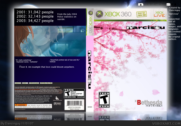
On how good it looks: 2/5 honestly. That back is extremely plain, lacking, and bad. And the front is VERY boring and plain. At least you know the right dimensions for the developer logos (although I might suggest making the Bethesda Softworks logo a little bit smaller).
I really like the front, to be honest. I wish more designers would take note and go for the more stylistic and minimalist approach. Mind you, not every cover benefits from it - but there are definitely covers out there with too much bells and whistles on it that makes my eyes bleed.
The spine works well with the front but I'll agree it feels a bit forced. It needs....something.
I really dig the front, though, it works very well - not only design-wise but considering the game itself. Well done.
 Narcissu Box Cover Comments
The back kinda sucks, but I didn't have any ideas.
[ Reply ]
...Huh?
[ Reply ]
#2, What now?
[ Reply ]
I don't understand this box...
[ Reply ]
What don't you understand? Just rate it on how good it looks.
[ Reply ]
On how good it looks: 2/5 honestly. That back is extremely plain, lacking, and bad. And the front is VERY boring and plain. At least you know the right dimensions for the developer logos (although I might suggest making the Bethesda Softworks logo a little bit smaller).
[ Reply ]
A little on the plain side. I give it a 2.5/5
[ Reply ]
I really like the front, to be honest. I wish more designers would take note and go for the more stylistic and minimalist approach. Mind you, not every cover benefits from it - but there are definitely covers out there with too much bells and whistles on it that makes my eyes bleed.
The spine works well with the front but I'll agree it feels a bit forced. It needs....something.
I really dig the front, though, it works very well - not only design-wise but considering the game itself. Well done.
Overall 4/5
Edit: Dyslexic keyboard... no really!
Edited at 1 decade ago
[ Reply ]