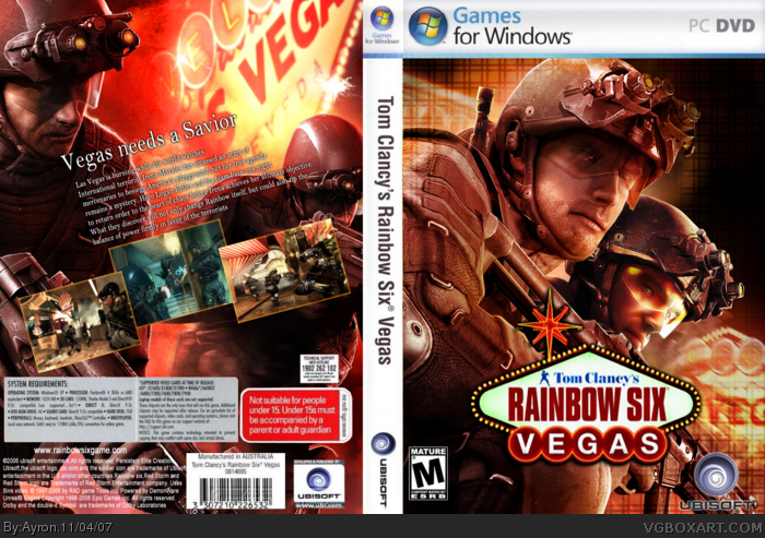
My Rainbow six vegas box.
Influenced by alot of boxes on the site.
First version is in imandix-setting. but i just can't convert it to 3d. if anyone would do that, and PM me the 3d version. i'd be very gratefull.
Comments/Favs appreciated.
Hope you like it.
-Ayron
The front needs to have a bigger logo and if this one would cutthe head of the right man, put him a little bit higher. You can do better with the screens on back and the text should be bigger. Actually, the back looks boring and plain.
All the comments Ayron's been receiving from frenchboy1 haven't been very helpful. Explain your reasons. Ayron, good work! I actually like it! The back looks cool and well put. So does the front.
ayron, i love your work, and i love this front. i have 2 suggestions for you.
1.the side maybe needs a vibrant side to it, such as red from the front
2.i think you need to vary your text for the back of your boxes, they kind of seem bland
#5, WTF are you talking about ? I didn't said my boxes are better and I didn't degrading your boxes. I just said what's wrong for me. When I see comments from worse boxartist than me, I don't critics their boxes. If I think they're right, I change stuffs, if I think they're wrong, I don't say anything. Final point.
Okay, the back is pretty good, I see you tried to follow the style of the original. I think a better font choice is needed and maybe a more interesting screenshot border. The front is really good, you did a good job blending. :)
You should point out the negatives of the box, BUT in a positive light, eg. the back does not have a good font so I think you should change to a new one to make it look better.
 Tom Clancy's Rainbow Six Vegas Box Cover Comments
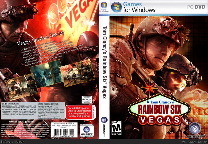
My Rainbow six vegas box.
Influenced by alot of boxes on the site.
First version is in imandix-setting. but i just can't convert it to 3d. if anyone would do that, and PM me the 3d version. i'd be very gratefull.
Comments/Favs appreciated.
Hope you like it.
-Ayron
[ Reply ]
The front needs to have a bigger logo and if this one would cutthe head of the right man, put him a little bit higher. You can do better with the screens on back and the text should be bigger. Actually, the back looks boring and plain.
[ Reply ]
All the comments Ayron's been receiving from frenchboy1 haven't been very helpful. Explain your reasons. Ayron, good work! I actually like it! The back looks cool and well put. So does the front.
[ Reply ]
#3, comments on my boxes are like that. I explained !
[ Reply ]
#4, Dude. you've been degrading to almost every box i've made.
it's not that you're alot better than me.
[ Reply ]
ayron, i love your work, and i love this front. i have 2 suggestions for you.
1.the side maybe needs a vibrant side to it, such as red from the front
2.i think you need to vary your text for the back of your boxes, they kind of seem bland
4/5, try to fix those things and its a 5/5+fav
[ Reply ]
#5, WTF are you talking about ? I didn't said my boxes are better and I didn't degrading your boxes. I just said what's wrong for me. When I see comments from worse boxartist than me, I don't critics their boxes. If I think they're right, I change stuffs, if I think they're wrong, I don't say anything. Final point.
[ Reply ]
#7, i quote:
"The back looks boring and plain.
you're comments on my boxes have been like that every time since your new account....
[ Reply ]
#7, you didn't even bother posting what was actually good about the box. You do that to all of Ayron's boxes.
[ Reply ]
Okay, the back is pretty good, I see you tried to follow the style of the original. I think a better font choice is needed and maybe a more interesting screenshot border. The front is really good, you did a good job blending. :)
[ Reply ]
#9,8, So, you want me I say only the good stuffs about your box. Well, sorry if I offended you Ayron...
[ Reply ]
#11, I don't think he means it that way.
You should point out the negatives of the box, BUT in a positive light, eg. the back does not have a good font so I think you should change to a new one to make it look better.
[ Reply ]
#12, well, maybe.
[ Reply ]
#12, exactly.
[ Reply ]
Looks good but i think the back needs something at the top. Idk what.
[ Reply ]
Having Logan on there twice ruined it for me...
[ Reply ]
#16, Hes on every wallpaper get use to it
[ Reply ]
No, I mean he's on the front twice.
[ Reply ]