#12, lol I'm a little bit like you, I always looking for a game to make a box for it. And it's pretty hard when you've done around 200 boxes... Exactly 219.
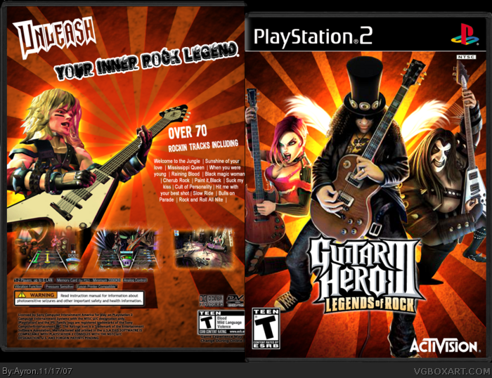
Here's my opinion. Those screenshots are from Guitar Hero 2. And yes, it does matter, because the style of the rock meter and note board (or whatever you call it) are different. Additionally, I think the words "Unleash" and "your inner rock legend" should be the same font/size.
P.S. I know what font you used for the word "Uleash"!
 Guitar Hero III Box Cover Comments
Re-upload.
some minor flaws were spotted, and people couldn't see it in small view.
i recommend full view for the box.
Hope you like it,
-Ayron
[ Reply ]
i think its great!
a few things i dont like are:
overused front pic
the clour scheme
4/5
[ Reply ]
#2, Well yeah, there are little pictures available.
and what's wrong with the front pic?
[ Reply ]
#3, theres nothing wrong with it i didnt say there was.
[ Reply ]
Isn't it "Unleash Your Inner Rock STAR"? Just wondering.
Also, shouldn't there be an Online Play logo on the front?
[ Reply ]
The back is a bit empty
[ Reply ]
#5 the ps2 version doesnt have online
[ Reply ]
front rocks, i like it, but i agree that the back is empty
[ Reply ]
yer, i might do something to the back.
[ Reply ]
Great work Ayron. The back feels a bit empty though. I still like it.
[ Reply ]
The front is really nice. Except the fact I don't like the colourscheme, it still nice. The back is too empty though. you can Do WAY better dude !
Edited at 1 decade ago
[ Reply ]
#11, Well yeah, i guess we all have our ups and downs.
i'm kinda stuck on what boxes to do, and this wasn't really my style :P
thanks #10-11.
[ Reply ]
#12 i think you need to do something no one has thought of......like a new ds game or sumthin
[ Reply ]
#13, are you saying i'm not original >;P.
i'll think of sumfin though.
[ Reply ]
#14 no, i like youre work, alot!
[ Reply ]
#12, lol I'm a little bit like you, I always looking for a game to make a box for it. And it's pretty hard when you've done around 200 boxes... Exactly 219.
[ Reply ]
#16, yeah.
i've made 118 now. and i dunno what to do next.
[ Reply ]
I personally like the colorscheme. 4/5. The back is empty.
[ Reply ]
Here's my opinion. Those screenshots are from Guitar Hero 2. And yes, it does matter, because the style of the rock meter and note board (or whatever you call it) are different. Additionally, I think the words "Unleash" and "your inner rock legend" should be the same font/size.
P.S. I know what font you used for the word "Uleash"!
[ Reply ]
Nice. Great job!
[ Reply ]
#2, SLASH IS NEVER, I MEAN NEVER OVERUSED!
The box is cool. Back seems to lack something.
[ Reply ]
#21, whaha lol.
if i'd made 'unleash' and 'your inner rock legend' the same font/size, it would look a whole lot worse than now.
Thanks #18-21
[ Reply ]
Why does he have wings he is far from an angel lol. Good box.
[ Reply ]
Slash's talent as a guitar player is wasted on the bands he's been in.
[ Reply ]
#23, just a small rock-type effect x]
[ Reply ]
the only edit on the front I can see from the originall cover is the wings, why didn't you do a new one that looks more ownmade or how to say it...
[ Reply ]
It Was Good! I Tried To Draw It But It Was HARD!
[ Reply ]
nice box
[ Reply ]