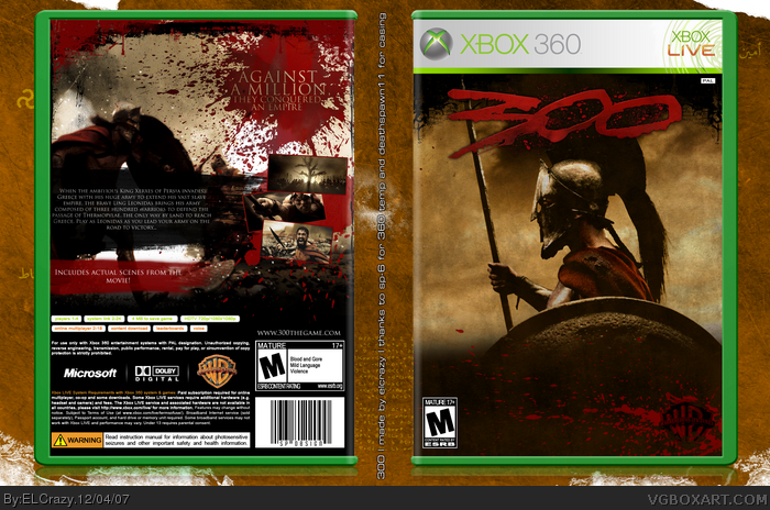
[ Buy 300 at Amazon ] By ELCrazy 50 on December 2nd, 2007 No Printable Available [ Box updated on December 4th, 2007 ] [ original ] 300 Box Cover Comments Comment on ELCrazy's 300 Box Art / Cover. Cancel Reply Ervo 48 [ 1 decade ago ] Awe-friggin-some. [ Reply ] ElectricDynamite 34 [ 1 decade ago ] sweet! [ Reply ] g-ram13 1 [ 1 decade ago ] wickid sick. too much blood on the back but that doenst matter [ Reply ] E_G 39 [ 1 decade ago ] Awesome, the only thing I don't like is the tiny screenshots on the back. [ Reply ] ELCrazy 50 [ 1 decade ago ] Hey guys, sorry for the late comment. Damn server. Anyway, version 1 is 2D, which I highly recommend if you want to see it in full. #1-4 thanks guys! :) [ Reply ] thecodemaster 41 [ 1 decade ago ] Really captures the image of the film/game. Lovely, yet disgusting, blood splatter on the back. Also, E_G is right about the screenshots... Nice box! [ Reply ] ELCrazy 50 [ 1 decade ago ] #6, Yeah, I might change the screenshots. Thanks man. :) [ Reply ] ELCrazy 50 [ 1 decade ago ] I actually thought this would've gotten more comments :( [ Reply ] xIAMHUNTERx 43 [ 1 decade ago ] I've looked at this a couple times, but I could never think of something to comment on... It looks good, but there's a line between the two pics on the front. It looks a little sloppy. [ Reply ] Ladykiller 42 [ 1 decade ago ] The front is alright. The back is nice even better. But the gazillion blood splatters distract more than it should and makes it look really busy. Still great bud. [ Reply ] ELCrazy 50 [ 1 decade ago ] Updated, don't ask about the shine. Edited at 1 decade ago [ Reply ] xIAMHUNTERx 43 [ 1 decade ago ] Okay, screw it. I'ma fave. Why was this not your comp box? [ Reply ] ELCrazy 50 [ 1 decade ago ] #12, That's what I thought. Shit. I might have had the chance of winning. Thanks for the fav :) [ Reply ] xIAMHUNTERx 43 [ 1 decade ago ] No prollem. [ Reply ] TrevOwnz 42 [ 1 decade ago ] Fix the screen shots and it will be so sweet. [ Reply ] Ayron 47 [ 1 decade ago ] #15, i agree. i also believe the blood spatters should look the same [ the stripe is transparent, whereas the real 'spatter' is as opaque as a rock ] [ Reply ] ELCrazy 50 [ 1 decade ago ] #16, Stripe? [ Reply ] ELCrazy 50 [ 1 decade ago ] I will be fixing the screenshots soon. Watch for it! :) [ Reply ] Sp-6 40 [ 1 decade ago ] this is greataa!:) but i think that the front would be better without these ships. [ Reply ] dmshaposv 47 [ 1 decade ago ] Great job, same nitpicks like the others though - bigger screens, and maybe get rid of the ships. Edited at 1 decade ago [ Reply ] ELCrazy 50 [ 1 decade ago ] Hmmm....yeah, I think the ships will be gone. Watch out for the updated version soon! :) [ Reply ] ELCrazy 50 [ 1 decade ago ] Edited at 1 decade ago [ Reply ] ELCrazy 50 [ 1 decade ago ] The long-awaited update. :) Thanks to DS11 for casing. [ Reply ] Ervo 48 [ 1 decade ago ] Kool. [ Reply ] ELCrazy 50 [ 1 decade ago ] #24, thanks :) [ Reply ] ELCrazy 50 [ 1 decade ago ] No one? [ Reply ] Ayron 47 [ 1 decade ago ] great update. ;) [ Reply ] ELCrazy 50 [ 1 decade ago ] Thanks man :) [ Reply ] DeathSpawn11 47 [ 1 decade ago ] looks awesome dude. =) [ Reply ] ELCrazy 50 [ 1 decade ago ] #29, thanks man (: appreciate the fav. [ Reply ] Dark Artist Bushido 1 [ 1 decade ago ] I always liked that side view pic of Leonidas, and that WB splatter logo is really cool. The back cover is awesome! *thumbs up* [ Reply ]
 300 Box Cover Comments
Awe-friggin-some.
[ Reply ]
sweet!
[ Reply ]
wickid sick. too much blood on the back but that doenst matter
[ Reply ]
Awesome, the only thing I don't like is the tiny screenshots on the back.
[ Reply ]
Hey guys, sorry for the late comment. Damn server.
Anyway, version 1 is 2D, which I highly recommend if you want to see it in full.
#1-4 thanks guys! :)
[ Reply ]
Really captures the image of the film/game.
Lovely, yet disgusting, blood splatter on the back.
Also, E_G is right about the screenshots...
Nice box!
[ Reply ]
#6, Yeah, I might change the screenshots.
Thanks man. :)
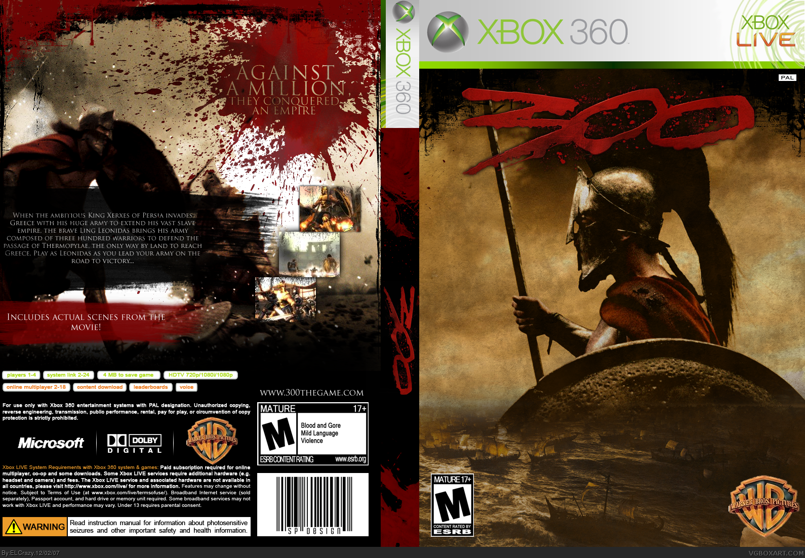
[ Reply ]
I actually thought this would've gotten more comments :(
[ Reply ]
I've looked at this a couple times, but I could never think of something to comment on...
It looks good, but there's a line between the two pics on the front. It looks a little sloppy.
[ Reply ]
The front is alright. The back is nice even better. But the gazillion blood splatters distract more than it should and makes it look really busy. Still great bud.
[ Reply ]
Updated, don't ask about the shine.
Edited at 1 decade ago
[ Reply ]
Okay, screw it. I'ma fave.
Why was this not your comp box?
[ Reply ]
#12, That's what I thought. Shit. I might have had the chance of winning.
Thanks for the fav :)
[ Reply ]
No prollem.
[ Reply ]
Fix the screen shots and it will be so sweet.
[ Reply ]
#15, i agree.
i also believe the blood spatters should look the same [ the stripe is transparent, whereas the real 'spatter' is as opaque as a rock ]
[ Reply ]
#16, Stripe?
[ Reply ]
I will be fixing the screenshots soon. Watch for it! :)
[ Reply ]
this is greataa!:)
but i think that the front would be better without these ships.
[ Reply ]
Great job, same nitpicks like the others though - bigger screens, and maybe get rid of the ships.
Edited at 1 decade ago
[ Reply ]
Hmmm....yeah, I think the ships will be gone. Watch out for the updated version soon! :)
[ Reply ]
Edited at 1 decade ago
[ Reply ]
The long-awaited update. :)
Thanks to DS11 for casing.
[ Reply ]
Kool.
[ Reply ]
#24, thanks :)
[ Reply ]
No one?
[ Reply ]
great update. ;)
[ Reply ]
Thanks man :)
[ Reply ]
looks awesome dude. =)
[ Reply ]
#29, thanks man (:
appreciate the fav.
[ Reply ]
I always liked that side view pic of Leonidas, and that WB splatter logo is really cool. The back cover is awesome! *thumbs up*
[ Reply ]