[ Box updated on December 8th, 2007 ] [ original ]
 Castlevania: The Dracula X Chronicles Box Cover Comments
Comment on MugglesMan111's Castlevania: The Dracula X Chronicles Box Art / Cover.
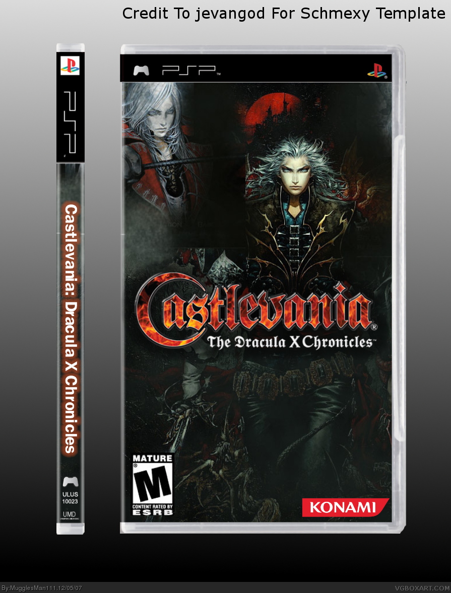
just a quickie. found some wallpapers, mixed thm, a few brushes here and there. Credits are on the box. let me know what you think
Edited at 1 decade ago
[ Reply ]
Cool box. Faved! You should add a back.
[ Reply ]
#2 well i was thinking of it....if more people like it, then yes i will.
P.S. hows my new avi?
Edited at 1 decade ago
[ Reply ]
#3, I liked your last one better.
[ Reply ]
Really nice, too much dark though.
[ Reply ]
Credit to Jevangod for the temp. Anyway Its nice I like it. And if any of you want my this temp I posted it on the templates only thread. Just make sure you give me credit
Edited at 1 decade ago
[ Reply ]
#6, It's a very shmexy template Jevan. :)
[ Reply ]
I seriously think you deserve more attention.
I believe this box is a work of art, and must be honored with an entry in the hall.
If not, you must be happy to know that alot of people liked your box.
Faved
[ Reply ]
#8, It still needs a back. P.S. Someone invert a 360 temp in Paint. It looks awesome!
[ Reply ]
#9, ehhm,no.
it doesn't have to have a back.
it looks great without it.
[ Reply ]
#10, Errrmmm... well I didn't say it doesn't look good. It should have a back though.
[ Reply ]
#11, dude its hi box he can do what ever he wants to the box
[ Reply ]
Um, I kind of love it.
[ Reply ]
wow, thanks everyone! oh and jevan, yure credit is on the temp...i may make a back, ill send it to ayron, hunter, and jevan, before i post. and again, thanks!
Edited at 1 decade ago
[ Reply ]
Wow, this is really nice. You should add a back and a reflection (to make it look nicer). It looks very nice. This is how wallpapers should be used. 4.5/5 (add a snazzy back for a 5/5).
Edited at 1 decade ago
[ Reply ]
#15, I don't think you should take away from the score just because it doesn't have a back. He said he's adding one anyway. (Maybe)
[ Reply ]
#14, and mot ME?!?!?! I thought we were friends! I wanna help!
BTW, teh box is sik!
[ Reply ]
#17 and you too....:)
[ Reply ]
#18, yay!
[ Reply ]
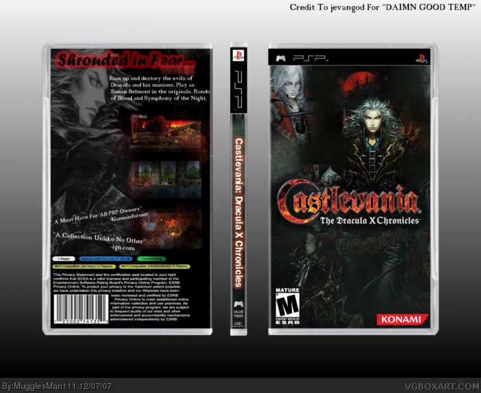
yay a back! sorry i couldnt send it to you guys...it wasnt working! anyways, here it is. it may not be that good, and it was pretty hard cause material is scarce so yea...
[ Reply ]
Yes!!! This rocked my world... I am no longer a virgin! XD
[ Reply ]
a long update...and only one comment.:0
[ Reply ]
it's nice
BUT![ yes, there's a big hairy but.. ]
- The red glow is too big.
- the pattern on the screenshot looks bad.
- the quotes'll look better aligned and horizontally parallel.
- The text would look better next to the screenshots.
- perhaps more text wouldn't kill it ^^'
[/BIGHAIRYBUTT]
Hope that helped mate ^^'
-Ayron
[ Reply ]
the tagline font could be much better. but overall still very nice :)
[ Reply ]