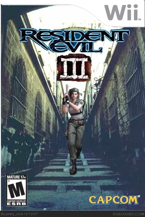
It actually made me crack a chuckle. Not in a bad way, but the way you made her running down those stairs was pretty funny.
-Get a different template.
-Get a different logo.
-The Capcom logo isn't cut out so good.
-Get a different image.
This was most likely made over Paint, I suggest getting Gimp, it's free and have an ownage name.
I recommend adding more blue-grey to Jill in order for her to blend in. If you can (I don't know what you're using, as I have the attention span of a cockroach, but I'm referring to photoshop terms, which usually go hand-in-hand with GIMP usage.) try copying the layer with Jill, locking it (So that you can't add anything to it, only modify what you've already created on that layer) and color it all dull blue, then lower the transparency. It might help blend her in more. I'd also recommend a more clear logo, the "jitter" effect isn't very attractive.
#s 13 and 14, while I may not have seen what #9 said (Obviously, a flame of some sort) I have to point out that you don't have to be a master chef to know whether or not food is burnt or undercooked. I'm not defending him, I just disagree with the "let's see you do better" argument.
As a huge Resident Evil fan, this box is okay. What I recommend to you is a new Resident Evil 3 logo, preferably the original one, or the remake logo and just add a 3. And as for the cover itself, use Jill from the remake in her RE3 costume to make it seem like Resident Evil 3.
Add a Nemesis picture as well, there are some good ones in REUmbrella Chronicles..

 Resident Evil 3 Box Cover Comments
this is my first... what do you guys think?
[ Reply ]
It's ok fr a first but:
Capcom logo is cutout badly.
The character doesn't fit in with the background.
The template is bad. 3/5
I hate bad avatars.
Edited at 1 decade ago
[ Reply ]
Hmmmm not too bad for your first.
[ Reply ]
It actually made me crack a chuckle. Not in a bad way, but the way you made her running down those stairs was pretty funny.
-Get a different template.
-Get a different logo.
-The Capcom logo isn't cut out so good.
-Get a different image.
This was most likely made over Paint, I suggest getting Gimp, it's free and have an ownage name.
[ Reply ]
#4, Why don't you ever just save time and say something like "I agree with #2". Also, you use Paint.
[ Reply ]
what do you mean by template?
[ Reply ]
#6, The Wii banner thing at the top that has the logo on it.
[ Reply ]
oh okies :)
[ Reply ]
know affence but this is crap
[ Reply ]
justify youre criticism
[ Reply ]
<<<<<please delete this post>>>>>
(rock the boat don't rock the boat baby rock the boat)
Edited at 1 decade ago
[ Reply ]
I like it, but Jill seems...not with the background, if you understand what I mean.
Apart from that, it's pretty good, better than all mine lol!
[ Reply ]
#5, I don't use Paint, I use Paint.NET/Gimp.
#9, who are you to criticize him, this is far better than anything you ever made.
[ Reply ]
#9, *cough*not one to talk*cough*
[ Reply ]
updated!
tried to make jill look more the pic, sorted the capcom,
got a bit carried away when blurring the title but my friend thought it looked cool :P
[ Reply ]
I recommend adding more blue-grey to Jill in order for her to blend in. If you can (I don't know what you're using, as I have the attention span of a cockroach, but I'm referring to photoshop terms, which usually go hand-in-hand with GIMP usage.) try copying the layer with Jill, locking it (So that you can't add anything to it, only modify what you've already created on that layer) and color it all dull blue, then lower the transparency. It might help blend her in more. I'd also recommend a more clear logo, the "jitter" effect isn't very attractive.
#s 13 and 14, while I may not have seen what #9 said (Obviously, a flame of some sort) I have to point out that you don't have to be a master chef to know whether or not food is burnt or undercooked. I'm not defending him, I just disagree with the "let's see you do better" argument.
[ Reply ]
As a huge Resident Evil fan, this box is okay. What I recommend to you is a new Resident Evil 3 logo, preferably the original one, or the remake logo and just add a 3. And as for the cover itself, use Jill from the remake in her RE3 costume to make it seem like Resident Evil 3.
Add a Nemesis picture as well, there are some good ones in REUmbrella Chronicles..
[ Reply ]