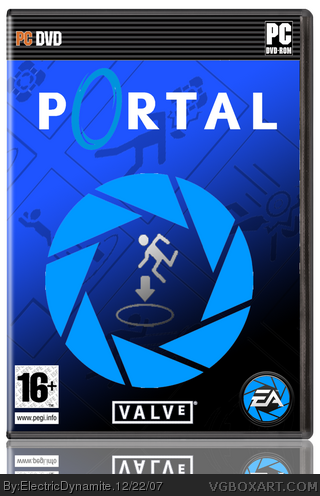
Stick man doesnt look any good ;/ create your own with tools and will be great
I noticed that on the right side there is visable last work on this template ;D Just slightly move this layer to right,about 2-3 pixels will do great !
Faved,its rly nice idea! Cheerz
May I suggest, though, to avoid having text or title colors overlap background colors (case and point: The Portal "O" is blue against a blue background). Either make the background another color like orange (though the whole thing wouldn't look anywhere near as good), or do something easy, quick, and simple like a subtle stroke effect around that Portal "O". Just avoid overlaying logos and text from matching that of the background.
 Portal Box Cover Comments
My Portal Boxart
[ Reply ]
Nice, I really like it.
Although I find the stickman stretched a tad a much. If you can somehow fix it, I'll fav it ;)
P.S. awesome EA logo
[ Reply ]
#2, agreed. I love the EA logo.
[ Reply ]
i dislike how the EA logo and portal box have the same design thing but separate it looks sweet.
[ Reply ]
I like the EA logo, but I agree with TrevOwnz ;)
[ Reply ]
Stick man doesnt look any good ;/ create your own with tools and will be great
I noticed that on the right side there is visable last work on this template ;D Just slightly move this layer to right,about 2-3 pixels will do great !
Faved,its rly nice idea! Cheerz
[ Reply ]
i like it. I don't think this would be rated 16 though.
[ Reply ]
very nice
[ Reply ]
awesome
[ Reply ]
i like it, reminds me alot of mine tho :) - link
[ Reply ]
I like it. Captured the style well.
May I suggest, though, to avoid having text or title colors overlap background colors (case and point: The Portal "O" is blue against a blue background). Either make the background another color like orange (though the whole thing wouldn't look anywhere near as good), or do something easy, quick, and simple like a subtle stroke effect around that Portal "O". Just avoid overlaying logos and text from matching that of the background.
Just nitpicking.
[ Reply ]