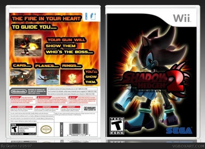
it's nice for a second,definetly better than my second box.
here are some tips:
-Shadow logo is hard to reead, try editing the lightning settings.
-Sega logo isn't the official one, the right one has like white stripes nd stuff.
-esrb is stretched, look at official boxes for the good size.
-Background on the back's a bit lame, and too light in contradiction to the front.
-The text is a bit bad, add some more text, and delete the flame-effect on it.also, the stroke isn't that good.
 Shadow the Hedgehog 2 Box Cover Comments
My 2nd box art!
Credit goes to Koopa Dasher for the template.
[ Reply ]
it's a good box for a second 4/5
[ Reply ]
It's better than my first boxes 4/5
[ Reply ]
Its better than all of my boxes
favorated 4/5
[ Reply ]
it's nice for a second,definetly better than my second box.
here are some tips:
-Shadow logo is hard to reead, try editing the lightning settings.
-Sega logo isn't the official one, the right one has like white stripes nd stuff.
-esrb is stretched, look at official boxes for the good size.
-Background on the back's a bit lame, and too light in contradiction to the front.
-The text is a bit bad, add some more text, and delete the flame-effect on it.also, the stroke isn't that good.
hope it helped,
-Ayron
[ Reply ]
nice second! 4.5/5
[ Reply ]
I like your front cover
[ Reply ]