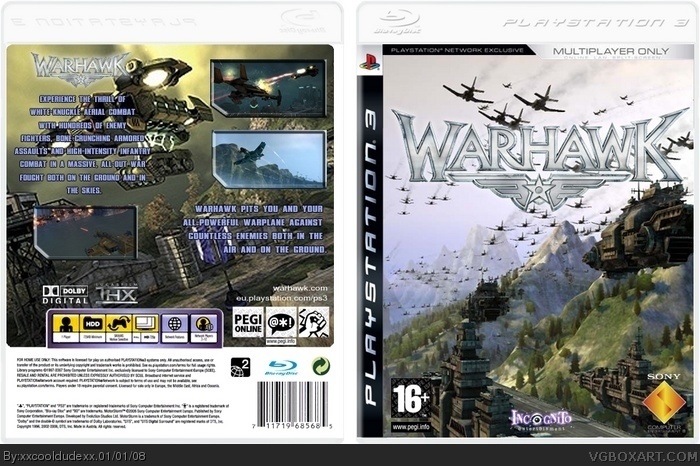
The logo needs to be centered, it should be higher, it should have a better image, you need dev logos and an ESRB, you needs screens and text on the back, it could use some text on the spine, you also need a better image back there.
Updated - I found out how to update the box, instead of posting it like a new one...
I wasn't too sure about the font... but they did it on the real box, maybey i should add a stronger 'glow' and change to a more suitable font than 'arial' :p
Also I'm not too happy how the multiplayer only came out on the front, way too blurry... apart from that personally I think this didnt come out half bad...
#6, ok, for starters, I meant to say 2/5. Second, it's better now. I think a better font color and maybe a better picture for the back would be nice. 3.5/5
Thanks #11, I wasnt expecting any favs for my first box, but thanks to your and TwistedTinkerToyyour's advice... i think i have improved it quite a bit... now to move onto my next box :D
 Warhawk Box Cover Comments
My First Ever Box! Please Comments & Criticism Appreciated...
[ Reply ]
The logo needs to be centered, it should be higher, it should have a better image, you need dev logos and an ESRB, you needs screens and text on the back, it could use some text on the spine, you also need a better image back there.
It's ok for a first though. Welcome to the site.
27/5
[ Reply ]
thanks #2 :D
[ Reply ]
this is by far the best warhawk one so far
[ Reply ]
#4, WTF i didnt say that
juan u jew stop going on my account and posting on ur own work
THIS IS BY FAR NOT THE BEST WARHAWK ONE SO FAR
just to make that clear
[ Reply ]
Updated - I found out how to update the box, instead of posting it like a new one...
I wasn't too sure about the font... but they did it on the real box, maybey i should add a stronger 'glow' and change to a more suitable font than 'arial' :p
Also I'm not too happy how the multiplayer only came out on the front, way too blurry... apart from that personally I think this didnt come out half bad...
[ Reply ]
#6, ok, for starters, I meant to say 2/5. Second, it's better now. I think a better font color and maybe a better picture for the back would be nice. 3.5/5
[ Reply ]
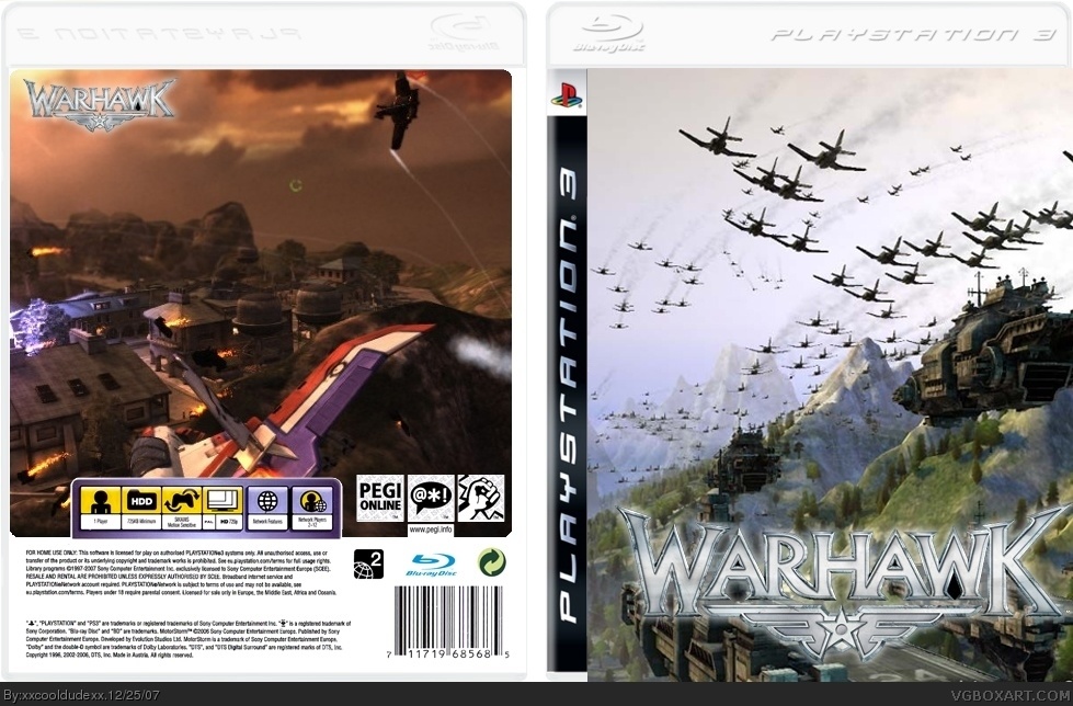
Ok, slightly lighter colour on the text, new font, outer glow... websites added...
[ Reply ]
great. no spine. but thats ok. fav+
[ Reply ]
#9 Thanks for the Fav =] I will most likely not do a spine as i will screw up or something, and first i would like to slightly clean up this...
[ Reply ]
Nice job.
+fav
[ Reply ]
Thanks #11, I wasnt expecting any favs for my first box, but thanks to your and TwistedTinkerToyyour's advice... i think i have improved it quite a bit... now to move onto my next box :D
[ Reply ]
cant wait to see more of ur work
warhawk is an amazing game and u hav done it credit
5/5
[ Reply ]