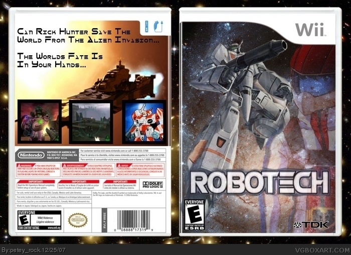
I love the front, good job, but the back is a little boring near the top. put more text, and different sects of it too, not just one paragraph. bullet points are always nifty, and also when making a back, putting a character or two is always a good thing. The borders are a little too big on those screenshots, and the text is a little too plain. I think I'm going to do a text/title tutorial under forums > Tips/Tricks/Tutorials > LK's resource thread. So once I make it, i'll give you the link to it and you can read it over at your leisure :D feel free to think of yourself as my apprentice, I'm always very willing to help, so never be afraid to ask :D
 Robotech Box Cover Comments
my brother gave me the idea :P
credit to koopadasher for the temp
feel free to comment and rate! :)
[ Reply ]
it's ok. nothing special, but not bad. 3/5
[ Reply ]
I love the front, good job, but the back is a little boring near the top. put more text, and different sects of it too, not just one paragraph. bullet points are always nifty, and also when making a back, putting a character or two is always a good thing. The borders are a little too big on those screenshots, and the text is a little too plain. I think I'm going to do a text/title tutorial under forums > Tips/Tricks/Tutorials > LK's resource thread. So once I make it, i'll give you the link to it and you can read it over at your leisure :D feel free to think of yourself as my apprentice, I'm always very willing to help, so never be afraid to ask :D
[ Reply ]