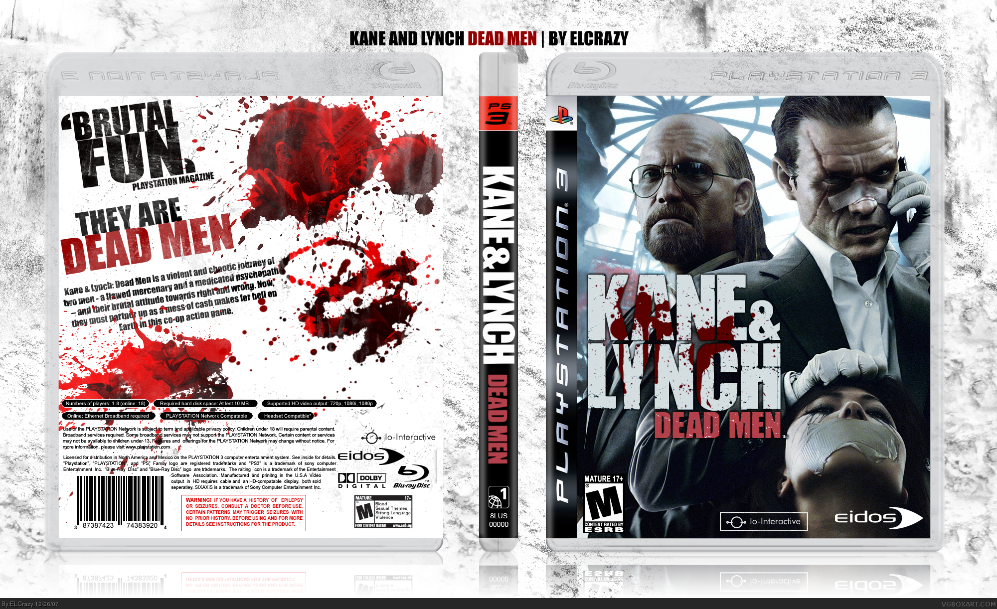
I like this. It's sleek, simple, fits the style of a hollywood-type PS3 title, and while the back is plain it shows that you're still nonetheless photoshop savvy (something worth noting, because I find it trivial when people become so highly praised for a great looking boxart, when they merely work off of great looking wallpapers and do little else to "personalize" it).
However, nonetheless, I do agree it's a little too plain on the back. While I think it's perfect as it is if I'm looking for a poster or desktop wallpaper...in the mindset of developing realistic boxart for games, you need content on the back that shows off the game in action that'll sell the product. That's just a tip to build on...fav'ing this regardless.
Even though the back is plain, if you look closely, there is texture, but it's hard to see.
I had the whole concept in my head, and I think it came out perfectly. I'm not really the kind of person who is anti-wallpaper, but I do not recommend artists to use wallpapers unless they do editing (contrasting, blending changes etc.)
 Kane & Lynch: Dead Men Box Cover Comments
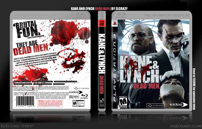
I finished it.
Hooway.
Enjoy! :)
Oh yeah, this is my last box for 2007.
Cred to Techne for the awesome temp.
Edited at 1 decade ago
[ Reply ]
Nice, but the back doesn't really stick out from the background, I'd try fixing that!
[ Reply ]
I like the front but the back is really plain and doesn't stick out from the background like Techne said.
[ Reply ]
Updated! :)
[ Reply ]
woah that is a good box! like the pic at the front same with the back! 5/5 + fav
[ Reply ]
Dude! Stop owning! Faved.
[ Reply ]
lol thanks guys (:
Edited at 1 decade ago
[ Reply ]
thanks for the faves, Ladykiller and Brettska!
[ Reply ]
blood splatter looks great!
[ Reply ]
Thats a sweet box. 5/5
[ Reply ]
Really cool.
Edited at 1 decade ago
[ Reply ]
i agree with techne, the back could use some sort of a background as well. great job nonetheless ^^
[ Reply ]
that is so fucking cool.
[ Reply ]
Remind me of Your The Club box...
But by the way, I find it better. The only thing I don't like is the fact that it's pretty hard to see the screens well... +fav then
[ Reply ]
#12, the back has a bg, if you look really closely ;)
thanks guys!
[ Reply ]
thanks for the faves! :)
[ Reply ]
Oh my bad ! I forgot to fav. it !
[ Reply ]
#17, lmao...=D
[ Reply ]
is that shady's temp?good job elcrazy.
[ Reply ]
I really like it but the back needs more where the white is. Maybe a wallpaper with a low opacity.
[ Reply ]
#20, Nah, it would ruin what I wanted for the back
#19, It's not Shady's temp.
[ Reply ]
I like this. It's sleek, simple, fits the style of a hollywood-type PS3 title, and while the back is plain it shows that you're still nonetheless photoshop savvy (something worth noting, because I find it trivial when people become so highly praised for a great looking boxart, when they merely work off of great looking wallpapers and do little else to "personalize" it).
However, nonetheless, I do agree it's a little too plain on the back. While I think it's perfect as it is if I'm looking for a poster or desktop wallpaper...in the mindset of developing realistic boxart for games, you need content on the back that shows off the game in action that'll sell the product. That's just a tip to build on...fav'ing this regardless.
[ Reply ]
#22, Hey thanks (:
Even though the back is plain, if you look closely, there is texture, but it's hard to see.
I had the whole concept in my head, and I think it came out perfectly. I'm not really the kind of person who is anti-wallpaper, but I do not recommend artists to use wallpapers unless they do editing (contrasting, blending changes etc.)
Thanks again. =D
[ Reply ]
#23, /he texture is hard to see indeed.perhaps fade a background into the white for a more "busy" feel?
[ Reply ]
#24, Nah, I intended it to look like a wall.
[ Reply ]
Bangin'.
[ Reply ]