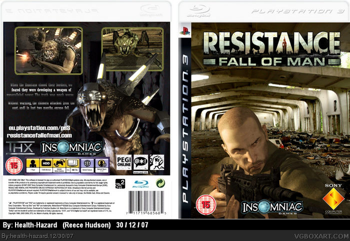
it's not all that bad.
here are some tips:
-Remove the white background, perhaps a gradient [ black-white seems effective] would work.
-use this as a thumb rule:use 3 screenshots in a box. [ resizing might work.make sure they keep the same dimensions.]
-make characters blend in with backgrounds. the front's realistic "tunnel" looks awful as a background for a video game render.
-make insomniac logo smaller.
-Don't use excessive text-effects. make sure it's legible.
 Resistance: Fall of Man Box Cover Comments
its my first so be nice :)
[ Reply ]
it's not all that bad.
here are some tips:
-Remove the white background, perhaps a gradient [ black-white seems effective] would work.
-use this as a thumb rule:use 3 screenshots in a box. [ resizing might work.make sure they keep the same dimensions.]
-make characters blend in with backgrounds. the front's realistic "tunnel" looks awful as a background for a video game render.
-make insomniac logo smaller.
-Don't use excessive text-effects. make sure it's legible.
Good luck.
[PM me if you need anything]
-Ayron
[ Reply ]
umm, better background, and font... (:P)
Edited at 1 decade ago
[ Reply ]
#2, kl kl thanks
[ Reply ]
#3, yh that really doesnt help much loser stop going on my account and posting on ur work
[ Reply ]
Wow that front cover reminds me of I AM LEGEND you know with WILL SMITH
[ Reply ]
#6, it sorta does to me too, also the box, its way better than my first box. . .
[ Reply ]
#5 WTF are you on about?
[ Reply ]