what better way to ring in the new year than to make a box about a terrorist group attacking Vegas. i dont know, but here it is! credit on the temp and ill say it here too. cred to tachne for temp temp. ok hope ya like.
well, i kinda figured the back didn't complement the front at all but i didn't want to just upload the front. it was hard finding a text to stand out on the back and i tried putting a border on the screenshots and well, it didn't look right. i respect your crits and they will help me improve, thanks guys.
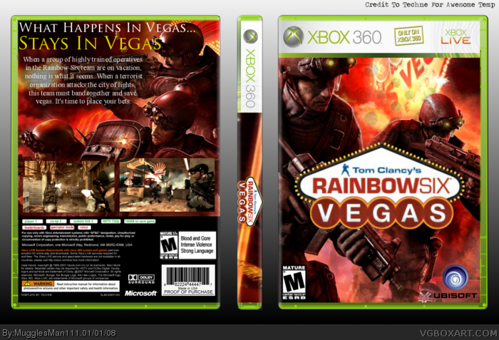
#9 Thats a terrible idea. Full boxes look 100 times better. It use some work but the back still looks good. Add 3 smaller screen shots with a border and fix the text so its all even and stuff.
Why don't you reply to are comments or update? Use are advice to make your box look better.
 Tom Clancy's Rainbow Six Vegas Box Cover Comments
what better way to ring in the new year than to make a box about a terrorist group attacking Vegas. i dont know, but here it is! credit on the temp and ill say it here too. cred to tachne for temp temp. ok hope ya like.
[ Reply ]
Front's nice, but I don't like the back.
the tagline font doesn't look good IMO, Screenshots could use a border or something, and it seems empty. Other than that, nice!
[ Reply ]
#2, I agree. Also, the screenshots are different sizes. I expected better from you, but the front is good still. 4/5
[ Reply ]
well, i kinda figured the back didn't complement the front at all but i didn't want to just upload the front. it was hard finding a text to stand out on the back and i tried putting a border on the screenshots and well, it didn't look right. i respect your crits and they will help me improve, thanks guys.
[ Reply ]
Great job. I agree about the font, though. Trajan Pro doesn't really fit this game.
[ Reply ]
#5 thnx for the fav dude! yea....
[ Reply ]
Make the spine logo a lot smaller and cut out that piece that is hanging out from the bottom of the spine.
[ Reply ]
Pretty cool, back's a bit plain though.
And PLEASE, don't overuse the Trajan Pro font. Try other font selections, most probably something that fits the game.
[ Reply ]
Maybe you shouldn't use the back. You could just update with the front. maybe.
[ Reply ]
#9 Thats a terrible idea. Full boxes look 100 times better. It use some work but the back still looks good. Add 3 smaller screen shots with a border and fix the text so its all even and stuff.
Why don't you reply to are comments or update? Use are advice to make your box look better.
Edited at 1 decade ago
[ Reply ]
perket cover thx
[ Reply ]