![]() »
»
[ Box updated on February 4th, 2008 ] [ original ]
 Mario vs Donkey Kong 3: Return of the Minis Box Cover Comments
Comment on TrevOwnz's Mario vs Donkey Kong 3: Return of the Minis Box Art / Cover.
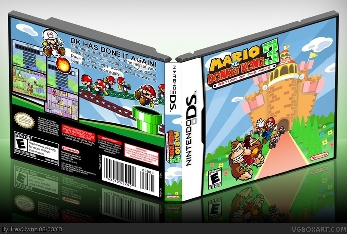
Ok this box I've been working on for a while. More than half the box is free hand. The main pilers shadow and bricks, door way, all of the ground, trees, flowers, walk way, sky, the 3 on the logo, the warp pipe, template and a couple other things. I like the background being really colorful and adding to the box ever more along with the reflection. This is one of my favorite boxes I've made and i hope you enjoy it as well.
[ Reply ]
5/5 +fav
[ Reply ]
DDDDDAAAAAAAAAAAAAAAAAAAAAAIIIIIIIIIIIIIIIIIIIIIMMMMMMMMMMMMMMMMMMMMMMMNNNNNNNNNNNNNNNNNNNNNNNNNNNNNNNNNNNNNNNNN!!!!!!!!!!!!!1
[ Reply ]
Thanks guys, #3 you should say that a little shorter haha.
Edited at 1 decade ago
[ Reply ]
Sickkkk!
[ Reply ]
The overall seems way too plain, sorry Trev, but you can do a lot better. Especially for the front...
[ Reply ]
i see, you must worked really hard on this. great job, top quality again:)
[ Reply ]
Awesome! This is great!
[ Reply ]
GREAT!!! :D :D
[ Reply ]
I don't know what to say...
[ Reply ]
#6, Seeing as how almost 90% of the front was hand done by me and one of your last boxes Super Mario Galaxy was just a wallpaper that very close up and yellow...i think its very good. The trees and everything looks very full to me in the front. Its Mario...i couldn't have a battle scene. I like the over all look sorry you don't. This is my work and don't expect a master piece. I like to show originality and hand made work, not just wallpapers on every box. Nintendo boxes I'm more creative on because they have a lot more images to use.
Thanks to everyone that commented and favs =]
[ Reply ]
"Don't expect a masterpiece"
--Well, you do a pretty good imitation. :P
[ Reply ]
Thanks #12 makes me feel better.
[ Reply ]
Trevownz, I love you for this box
[ Reply ]
#13, Dude, you're like... A wizard.
[ Reply ]
#15 yes when i was a baby i got attack by a boxart and ever sense have grown my strengths to defeat it. , sort of like harry potter lol jk.
Thanks again guys
[ Reply ]
Haha, Voldemavwolf. :P
[ Reply ]
Trev + Mario VS. Donkey Kong = win.
#17, Lol.
[ Reply ]
Great box m8! I do think it looks slightly plain on the front like frenchboy1 said --- would have been better if you made the characters much larger, like Donkey Kong half height of box.
Anyway... apart from that excellent job!
OH... the only thing I don't like is OUTSIDE the box.. the background is off-putting... especially as the reflection blends with it... and as you know.. that's not gonna happen ;)
[ Reply ]
es nice!
[ Reply ]
Thanks for the comments and favs everyone =]
[ Reply ]
I have to agree with Marker that the characters are a bit too small on the front, but overall it's great and the effort shows ^_^
[ Reply ]
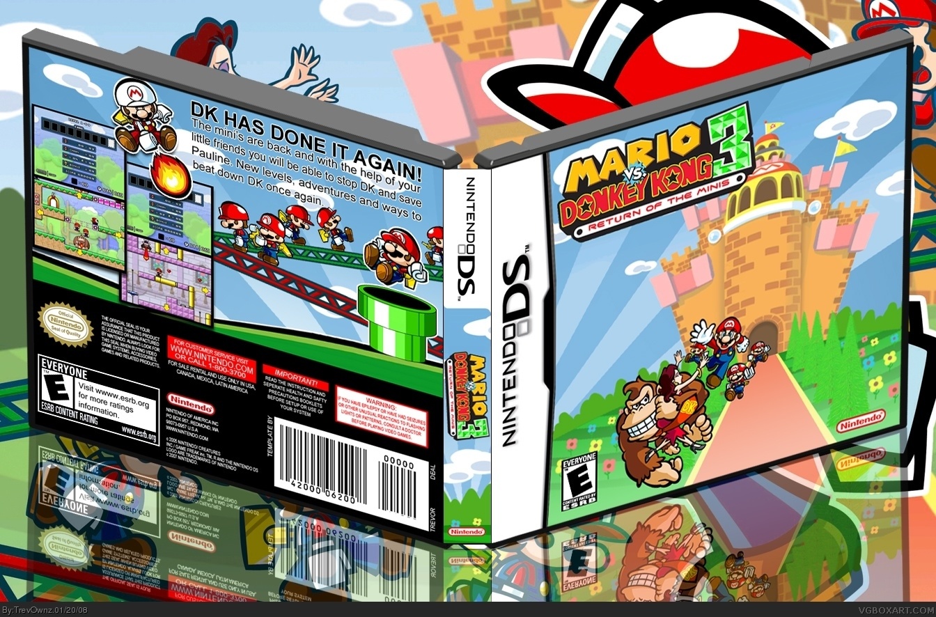
Ok guys i changed the background to a more basic background that doesn't clash with the reflection. What do you think?
[ Reply ]
Nice, but if you closely look at the back the copyright date says 2007, I would sggest changing that.
[ Reply ]
Nice but I don't like the logo placement. I would place the logo in the middle of the castle.
[ Reply ]
#25 but that would cover the castle up and i wanted it to show =] and #24 does it matter the copyright date? i made the box in 2007 so what does it matter.... this isn't a real game i made the logo. Its a sequel that never came to be so if i made the boxart in 2007 don't you think the game would have came out the same year? anyways thanks for the comments guys.
[ Reply ]
YAY YOU FINALLY GOT TO SEVEN DOTS! *party*
[ Reply ]
Hahaha thanks. Yeah i don't know what to call them or if its a rank or whatever. My GF was asking me what they were and i was like ummmm... dots i guess.
[ Reply ]
now this i like 10/10+fav
[ Reply ]
Love it! Awesome!
[ Reply ]
Nice!
[ Reply ]