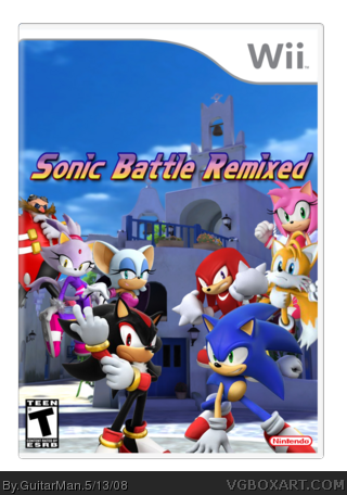
Ok another request i got. Credit to Techne for the template. I made the logo myself. i did not make the custom sonic characters i had one made for me and another was made for my friend. so credit to cap_dude and Miki of Sonic Blast for the custom 3-D sonic characters.
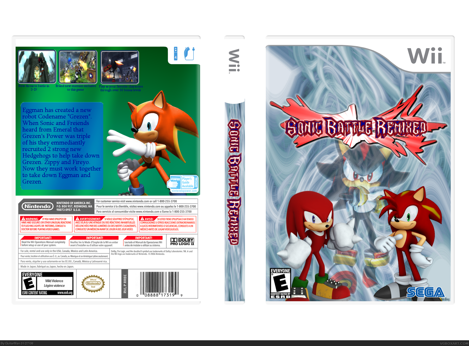
Well, like always, I like the front, but the back has the same layout as all of your boxes, and that's a bad thing. You kinda squish all the screens into the left courner. The back could also use a better background and a better font. My only suggestion for the front would be - If possible - to fade Eggman and sonic's faces into the background.
Wow, seriously? You had to get somebody else to design a Sonic recolor for you? I'm stunned.
The box art is pretty good, especially if you hold it to Sonic standards (most Sonic boxes submitted are utter trash.)
The thing is, there's not one, but TWO Sonic recolors. Character palette swaps are one of the most absurdly disgusting things someone can do, in my eyes. Either create a character, or use official characters. Don't make a green Megaman or a red Sonic and consider it a unique character.
Err... SEGA and SonicTeam logo are non-existant and the logo needs changing to blue fading into red or black. Other than that it is good so fave!
PS version 1 is better.
 Sonic Battle: Remixed Box Cover Comments
Ok another request i got. Credit to Techne for the template. I made the logo myself. i did not make the custom sonic characters i had one made for me and another was made for my friend. so credit to cap_dude and Miki of Sonic Blast for the custom 3-D sonic characters.
[ Reply ]
nice! Faved.
[ Reply ]
#2, awsome thanks Kirby
i bet someone is going to point out that Sonic isn't on the box. :P
Edited at 1 decade ago
[ Reply ]
Well, like always, I like the front, but the back has the same layout as all of your boxes, and that's a bad thing. You kinda squish all the screens into the left courner. The back could also use a better background and a better font. My only suggestion for the front would be - If possible - to fade Eggman and sonic's faces into the background.
Front = 4/5
Back = 2.5/5
Overall = 3.5/5
[ Reply ]
yeah the back it what gets me. i think i will fade Sonic on the Front and Eggman on the back
[ Reply ]
It's funny, 'cause dispite being "Sonic" Battle, there is no sign of him except for in the the tiny screens.
[ Reply ]
Wow, seriously? You had to get somebody else to design a Sonic recolor for you? I'm stunned.
The box art is pretty good, especially if you hold it to Sonic standards (most Sonic boxes submitted are utter trash.)
The thing is, there's not one, but TWO Sonic recolors. Character palette swaps are one of the most absurdly disgusting things someone can do, in my eyes. Either create a character, or use official characters. Don't make a green Megaman or a red Sonic and consider it a unique character.
[ Reply ]
PLEASE PM ME THE CHARACTERS!!!!! +fav
[ Reply ]
I love it.i fave it.can you pm the sonic characters please?
[ Reply ]
Not bad but i dislike the logo
[ Reply ]
Err... SEGA and SonicTeam logo are non-existant and the logo needs changing to blue fading into red or black. Other than that it is good so fave!
PS version 1 is better.
Edited at 1 decade ago
[ Reply ]
not bad. 4/5
Edited at 1 decade ago
[ Reply ]
hmm somthing doesn't seem right...
[ Reply ]