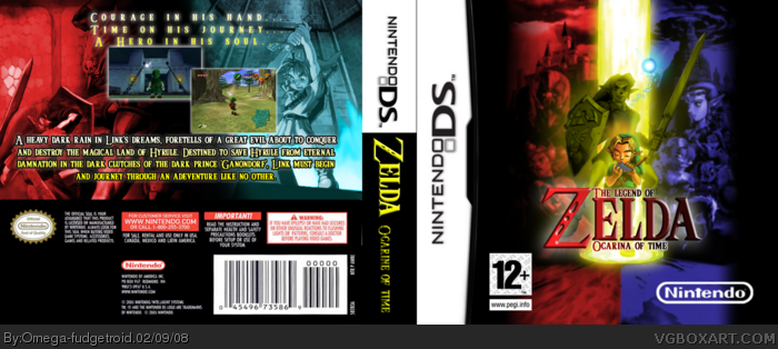
[ Box updated on February 9th, 2008 ] [ original ]
 The Legend of Zelda: Ocarina of Time DS Box Cover Comments
Comment on Omega-fudgetroid's The Legend of Zelda: Ocarina of Time DS Box Art / Cover.
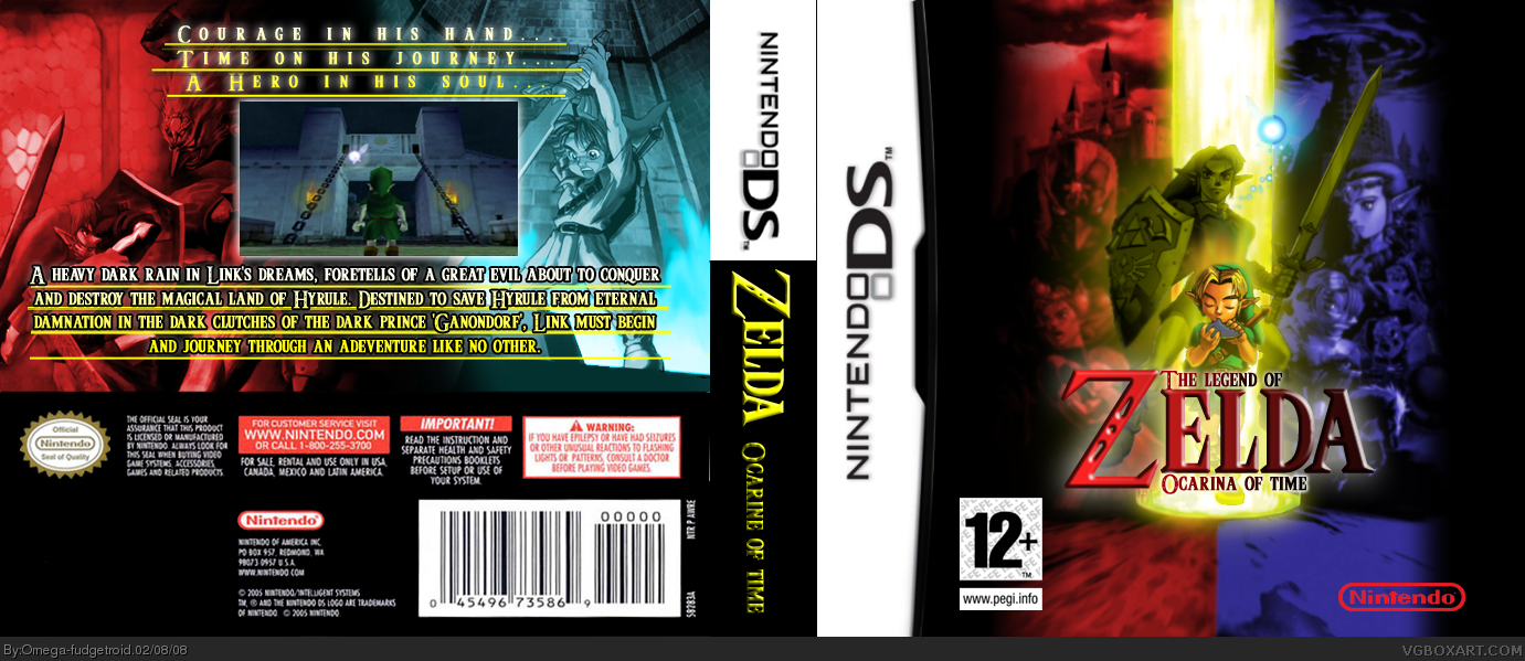
I'm very satisfied with this. And don't give me that "Wallpaper" nonsense. It's the result that counts.
[ Reply ]
i didnt know it was a walpaper so nice job! 4/5 maybe fill in the nintendo logo?
[ Reply ]
#2, Like a glow or something? Or maybe make it white...
And also, the wallpaper is just the picture. I've done all the colour arrangements and effects.
Edited at 1 decade ago
[ Reply ]
it looks great and fill it with white maybe?
Edited at 1 decade ago
[ Reply ]
#4, Okay, might do that tomorrow. Here in Sweden it's 2:41 am so I'm veery tired... :/
[ Reply ]
I like it, but the front is too blurry for my liking.
[ Reply ]
#6, I wanted the main part of the front to be more of the center of attention.
[ Reply ]
I like the front. The back doesn't seem very official looking though.
[ Reply ]
I also like the front. But try to take the underline off in the back.
Edited at 1 decade ago
[ Reply ]
i really like it, good job. here are some pointers:
-try and enlarge the image on the front so it takes up more space
-get a nintendo logo with white inside it
-add a rating on the back (probably in the bottom left corner)
-add a couple more screenshots if possible
-remove the underline on the text
4/5 so far. nice job!
[ Reply ]
Thanks for all the good critique. I'll see if I will change it during the day.
[ Reply ]
#10, According to all of my DS boxes laying here beside me, there is not supposed to be ratings on the back.
And if I would remove the lines under the text, they would look sporadically placed in the air. By using the lines, it feels like the back have a solid base everything is built upon.
Edited at 1 decade ago
[ Reply ]
Updated in the places I agreed in. The rest I keep the same.
[ Reply ]
well, you might as well put SOMETHING in that black space... anyway, good update. 4.5/5
[ Reply ]
#14, I want that black space... Feels more intruding, which enlightens the younger Link's courage shining. The box must show the darkness and the thing that's holding it back. That's also why I enlighted the yellow pillar in the middle.
[ Reply ]
#15, yeah, well... it's just part of the template... it doesn't really need to match (or contrast) the actual image. but whatever, do what you want with it.
[ Reply ]