![]() »
»
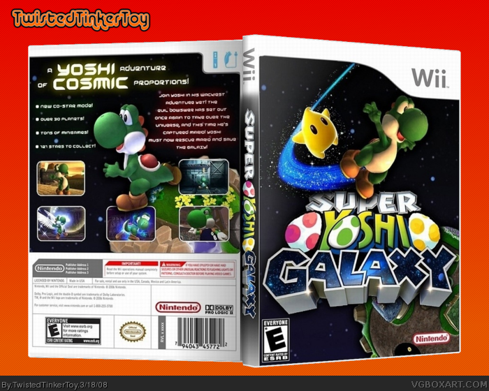
[ Box updated on March 19th, 2008 ] [ original ]
 Super Yoshi Galaxy Box Cover Comments
Comment on TwistedTinkerToy's Super Yoshi Galaxy Box Art / Cover.
Here it is! My masterpiece! This took me FOREVER! I went through 2 versions of this. Sorry about the description, but I sorta wanted the front to be the main focus.
Credit to MARKER for the awesome logo.
Credit to 89er for the planet.
Enjoy.
[ Reply ]
The fronts good, a little plain however.
The back could use some work because there is too much emptyness.
[ Reply ]
love it pure beauty 5/5 + fav
[ Reply ]
Hey it turned out good!
Some improvements, The Nintendo Logo would look better filled in white, Maybe the logo should be above Yoshi? Dont like the screenshot borders, the back looks a little spacious? (ha ha gettit?! SPACE-ious)
Anyway i would be happy to give you a better back description if you like? Let me know and i'll PM it to you =]
Edited at 1 decade ago
[ Reply ]
#2, well, the problem is that there weren't many things that I could fill it up with.
#4, I like where the logo is. The screenshot borders are similar to the ones on the official. I'm thinking of adding two more screenshots to the left and right of Yoshi.
Edited at 1 decade ago
[ Reply ]
#5, I guess.
Oh and i don't like how you used the same planet twice.
[ Reply ]
#6, only planet I could find. :|
[ Reply ]
#7 Check PM's =]
[ Reply ]
#7, I'll try and look for one.
Edit: Damn, Cerium beat me to it.
Edited at 1 decade ago
[ Reply ]
#9 No I gave him a better back description! Feel free to look for a planet for him =]
[ Reply ]
Im sorry but this is probaly your worst boxart.All of your boxes are preaty nice so this one sticks out. You can see the uncut pink egg going over the Super. The other egg is terribly cut out,You used the same exact planet and picture for your front and back, The screenshots are all oviasly from brawl(last one maybe strikers) the words on the back are so little thought out and ridiculus that you shouldnt have even made the back. You didnt cut the inside of the nintendo logo. But for the Bright side nice idea. (I would delete it while you can)
Edited at 1 decade ago
[ Reply ]
#11, what the hell are you talking about?
[ Reply ]
#10, Oh cool.
[ Reply ]
#11, Um... no. The egg has a black outline. He didn't even make the logo. And what game is he supposed to use screenshots from? I'm sorry, but barely any of those points are valid.
[ Reply ]
#14, thanks. What do you think of it?
[ Reply ]
#15, I like it, but I think the description on the back needs to be longer.
[ Reply ]
I can't find a decent planet, sorry.
[ Reply ]
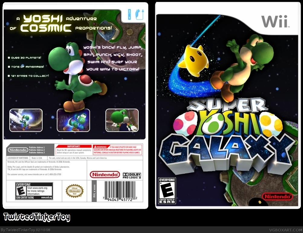
UPDATED! I added more screenshots, a white Nintendo logo and a new description! Credit to Cerium for the description, but I edited it a little so that it would fit.
[ Reply ]
That's a lot better. I might be able to find you a second planet...
[ Reply ]
#19, I would appreciate it.
[ Reply ]
alright the back looks good now. the only thing i dont like is the eggs shape and the same planet, which are not hard to do. (well unless you cant find a planet) And if he was given the logo and the eggs looked like that i would have edited it.You cant sit there and tell me that yellow egg looks fine
Edited at 1 decade ago
[ Reply ]
link
Heehee, I'm a ninja!
#21, The yellow egg looks fine. There, I just did. You obviously haven't played Yoshi's Island. It's SUPPOSED to look like it's drawn by hand.
Edited at 1 decade ago
[ Reply ]
#22, lol you got rid of mario with a star bit.
[ Reply ]
#22 i have played yoshis island and do u you know how far yoshis gone from Yoshis island. Its next gen and his eggs dont look like that anymore, even the egg for the O is more decent. and good find for a planet that looks perfect.
Edit: ok the box looks good now.
Edited at 1 decade ago
[ Reply ]
Yay! I really hope you like it now, because I fixed all your people's problems. Credit to 89er for the planet.
[ Reply ]
I love it!
[ Reply ]
#26, atleast SOMEONE appreciates my effort. Thanks.
[ Reply ]
no matter what anyone syas, i think its great. oh and 89er, im the ony ninja in these parts.
[ Reply ]
#28, Well, you're a ninja with GIMP, but I'm a Photoshop ninja!
[ Reply ]
#29, PhotoShop is awesome, so GIMP is more impressive. :P
[ Reply ]
ahright guys i think theres room for 2 ninjas in this tow--pag--box! yea. still...
[ Reply ]
#31, could we get back to the box now, please?
[ Reply ]
With all the updates and stuff and my (super) back description this looks really awesome and even better than my Super Sonic Galaxy box =D
+Fav
+Fav Author
[ Reply ]
#32 yes, this is very nice, great compromise here dude!
[ Reply ]
Thanks #33 and 34. I put a lot of time into this so I'm glad you like it.
P.S. Doesn't that Yoshi fit the Mario Galaxy style? XD
[ Reply ]
amazing 5/5 +fav
EDIT: yes it does fit the style
Edited at 1 decade ago
[ Reply ]
nice...
[ Reply ]
ahaha thats cute. only problem is the yoshi eggs are a little choppy but it's all around awesome! wish i'd thought of this.
[ Reply ]
Great job.
[ Reply ]
So many Galaxy boxes...
*copyrights the title Super Master Chief Galaxy*
[ Reply ]
#40, Goodie...
*copyrights Super Snake Galaxy*
[ Reply ]
*copyrights super VGMaster Galaxy*
[ Reply ]
*copyrights Super Reed Galaxy*
*copyrights the Ban Gun*
*and the Delete-O-Ray*
:P
[ Reply ]
10/10!
[ Reply ]
awsome box +fav
#40, i already have the copyrights to Paper Mario Galaxy
Edited at 1 decade ago
[ Reply ]
#43, "*copyrights the Ban Gun*"
Hey!
Oh, well. I guess you snooze, you lose...
*copyrights super VGBoxart Galaxy*
Edited at 1 decade ago
[ Reply ]
*copyrights the name Star89er*
Ha, you owe me money. :P
*copyrights the name xIAMHUNTERx*
HA!
Edited at 1 decade ago
[ Reply ]
#47, F***.
*copyrights Echo of Ban the Neon NOT brok3n Forsaken*
Haha, you owe me six times the money.
[ Reply ]
*copyrights every part of your body*
Betch, I OWN you now.
[ Reply ]
*copyrights your clothes*
Go get some clothes, you filthy hobo.
Let's stop spamming now...
[ Reply ]
*copyrights everything, ever*
Ha, you're all my slaves!
[ Reply ]
#51, *sues you for copyright infringement, because I already own part of everything!*
Nanananananananana Law suit!
Edited at 1 decade ago
[ Reply ]
Too bad I own the judge, the jury, and the lawyers!
*sends you to prison for impudence*
[ Reply ]
All right guys you need to stop spamming or this is going to have to be cleared up.
Edited at 1 decade ago
[ Reply ]
looks great TTT, thats alot of butt dust though, yoshi, needs a shower!
[ Reply ]
did you have this idea yourself? because i made the first yoshi galaxy box and if you saw mine you should credit me, even though mine was terrible to this masterpiece!
TTT, outstanding job! i cna tell you used a lot of brawl yoshis. This is really amazing. Out done yourself. HoF here you come!
[ Reply ]
#55, lol. He fits there though, don't he?
Thanks Kirby22.
[ Reply ]
Woof... I just noticed that the render (if you can call it that) of Yoshi on the front doesn't blend in at all with the background. :(
[ Reply ]
#58, well, it's not a huge problem, and I can't fix anything anymore because I lost the file. :(
[ Reply ]
UPDATED! Thanks MARKER, for the spine, and for making it 3D. :)
Edited at 1 decade ago
[ Reply ]
Something about this box really appeals to me, probably the fun feeling it evokes. I'll fav it.
[ Reply ]
Nice one mate! ;) Personally, I prefer Yoshi than Mario... he's just much more cooler than the short fat italian! LOL Good use of screenshots considering it's a fictious game.. and I love that glow'y font/tagline on back/ OH YEAH... since I did the logo, and spine.. I have to like them! LOL
[ Reply ]
#62, lol yeah, Yoshi rocks. Thanks E_G and MARKER, I'm glad you like it.
[ Reply ]
UPDATED! I added my new background. :)
EDIT: Got the colors wrong, and I can't delete new versions anymore. :(
Why Reed?!? Why must you take away the ability to delete new versions?!?
Edited at 1 decade ago
[ Reply ]
Very nice, love the font you used for the back=]
[ Reply ]
Yep yall are right yoshi is better at adventure games. The only game I dont like yoshi in is Super SMash Bros series. I love him in everything else though. Like mario kart, I wont play with anyone else but yoshi.
[ Reply ]
#66, Same! Fighting isn't yoshi's strong point unless he's attackin small turtle like creatures =]
[ Reply ]
#66, yeah, Yoshi rocks in Mario Kart DS.
[ Reply ]
Beats myself up for missing this*
Awesome job, TTT! I'm impressed. :)
[ Reply ]
this games will be so fun to play if it it was real. grand.
[ Reply ]
#70, I have to agree. Yoshi just seems to fit this well, did i mention +fav =]
[ Reply ]
Wow, thanks everybody.
P.S. What do you think of the new display?
[ Reply ]
#72, nice, and congrats on HoF =]
[ Reply ]
#72, It hurts my eyes, and I know it matches you avatar and all, but I don't like it. Anyways, congrats on the HoF man, well deserved, I must say. Lol, it's kinda weird when two Yoshi Galaxy boxes get into the hall consecutively.
[ Reply ]
w00t! Thanks guys! my second HoF! :D
[ Reply ]
#74, Kind of ironic, huh?
[ Reply ]
THIS IS AWESOME!!!! I love the idea! Cool Yoshi Logo Too! Fav+
[ Reply ]
Very Cool! I'd give 9/10 because you put Super Smash Bros. pictures but its still awesome!
[ Reply ]
WHY CAN'T THIS GAME BE REAAAL??? WHYYYYYY?!?!?!?!!!!!????
[ Reply ]
Awsome edit! Great to look at :) 5/5
[ Reply ]