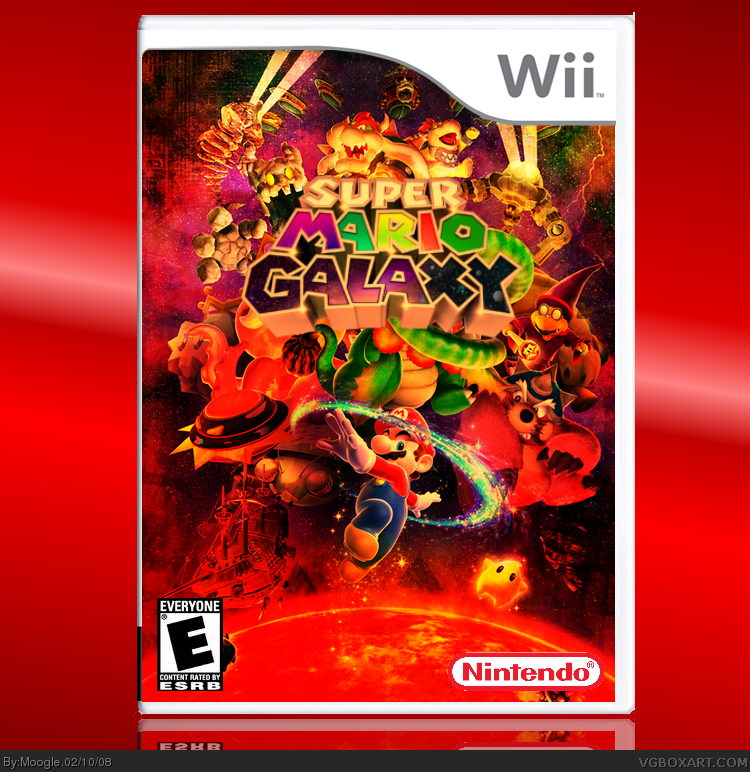
I know "Not another Galaxy box!" But the idea behind this was to go crazy with the brushes the textures the effects and make it look different from the others. Full view for best effect. Suggestions welcomed as always. Thankyou.
Sorry for the resubmit it wasnt viewable on the front page for some reason so I had to upload it again
#2, Excuse me, thats official artwork that /anyone/ can use. If you bothered to look in full view you could see new textures, lots of brushing and thunder and fire effects. I did not just make it red, and it is NOT copying EG's.
The editing in this is awesome but I just don't like how it looks. You can really see the hard work you put into the editing but IDK just doesn't do it for me.
I think you should go with a different background. red on red is kinda sketchy, maybe black or white, or even a fainted blue-white? but yeah. looks like a horror game, but with mario... it's good though, I can see the effort spilling out of it.
OH MY GOD!!
This is amazing!! So much effort has gone into this, especially when compared to about 70% of other Super Mario Galaxy boxes looking exactly the same!!
I want to fav this but I dont know... something doesn't look right??
I think it could possibly be the Nintendo logo looking too big. Maybe you should change it and its a fav from me =]
Thanks for all your comments and suggestions guys. Ill try to fix for the nintendo logo, its being a bit annoying at the moment. Thankyou all though ^^
Though I did edit a few things: The sun is yellow again for a bit more contrast, same with marios shoes to give him bit more color, along with the nintendo logo so it doesnt stick out like a sore thumb.
 Super Mario Galaxy Box Cover Comments
I know "Not another Galaxy box!" But the idea behind this was to go crazy with the brushes the textures the effects and make it look different from the others. Full view for best effect. Suggestions welcomed as always. Thankyou.
Sorry for the resubmit it wasnt viewable on the front page for some reason so I had to upload it again
[ Reply ]
dude you just added a little to E_Gs SMG and made it red
[ Reply ]
#2, Excuse me, thats official artwork that /anyone/ can use. If you bothered to look in full view you could see new textures, lots of brushing and thunder and fire effects. I did not just make it red, and it is NOT copying EG's.
Edited at 1 decade ago
[ Reply ]
That's cool! I love how you took that and REALLY edited it! I see a lot of effort here! Love it!
[ Reply ]
Meh... it's alright. I don't really like the textures and effects. And the Nintendo logo is huge and kinda choppy.
[ Reply ]
#4 Thanks Vg
#5 Thankyou for your opinion
Update: Nintendo Logo should be less choppy
[ Reply ]
The editing in this is awesome but I just don't like how it looks. You can really see the hard work you put into the editing but IDK just doesn't do it for me.
[ Reply ]
oh my mistake
[ Reply ]
#7: Thanks for the opinion
#8: Its alright, I just dont want it to be seen as a clone of Eg's when I put hours of effort into it.
[ Reply ]
Dude this is awesome!
5/5
[ Reply ]
I think you should go with a different background. red on red is kinda sketchy, maybe black or white, or even a fainted blue-white? but yeah. looks like a horror game, but with mario... it's good though, I can see the effort spilling out of it.
[ Reply ]
Really good job on the effects and stuffs. But ut doesn't really fit the game itself. Nice effort though.
[ Reply ]
It's okay, mainly because the whole 'grungy red' thing does not fit an up-beat space game.
[ Reply ]
The red is way too strong, and agreed with #12 and #13.
[ Reply ]
AWESOME
[ Reply ]
OH MY GOD!!
This is amazing!! So much effort has gone into this, especially when compared to about 70% of other Super Mario Galaxy boxes looking exactly the same!!
I want to fav this but I dont know... something doesn't look right??
I think it could possibly be the Nintendo logo looking too big. Maybe you should change it and its a fav from me =]
[ Reply ]
Thanks for all your comments and suggestions guys. Ill try to fix for the nintendo logo, its being a bit annoying at the moment. Thankyou all though ^^
Though I did edit a few things: The sun is yellow again for a bit more contrast, same with marios shoes to give him bit more color, along with the nintendo logo so it doesnt stick out like a sore thumb.
Edited at 1 decade ago
[ Reply ]
i really like the red. great job, moogle. 5/5+fav
[ Reply ]
#18, Thankyou ^^
Re-update: Should look crisper.
[ Reply ]
try adding a blue photo filter
[ Reply ]
awesome!the best super mario galaxy box in my opinion!
[ Reply ]
well i must admit this really
dosent look like the other mario galaxys
great job
[ Reply ]
3 words...
Oh... My... God.
[ Reply ]