#5, I think you should be more specific if you can.
I like this box but not the positioning of the screenshots because they're clashing with info, and the logo on the spine is not easy to make out either. Also I think the Blu-ray case is way too dark in comparison to the real thing.
Thank you, it's nice to have a positive comment. Although, the template isn't dark, if you open it up in full size it's lighter, if that's what yopu meant.
I think it's awesome... the only thing to improve it is the subtitle 'United We Fall' on the front. I think it would look nicer if it were a bit bigger and below the 'Resistance 2' logo... but it looks like that is how it originally came.
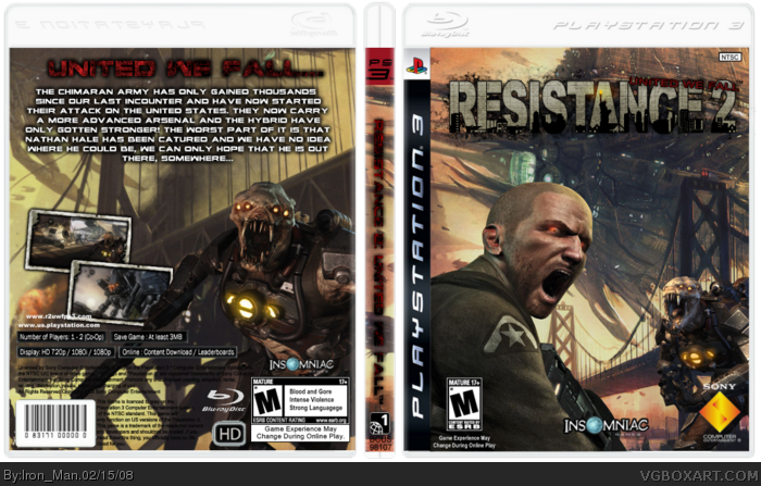
 Resistance 2: United we Fall Box Cover Comments
Yay! New upload. :) Credit to Skidd from My Resistance for the awesome logo and Wickedgamer1 for the pwnsome template.
I've been working on this since I woke up this morning, now I need to go take a shower. :)
Please comment, rate and if possible, favorite.
Edited at 1 decade ago
[ Reply ]
logo's very stretched...
[ Reply ]
#2, it's not stretched.
[ Reply ]
#2, it's supposed to be like that, that's how it was when I got it...
[ Reply ]
2/5 the back kinda ruined it changed that and it'll be a easy 4/5
Edited at 1 decade ago
[ Reply ]
#5, dude, the back is where most of the effort is.
Edited at 1 decade ago
[ Reply ]
#5, I think you should be more specific if you can.
I like this box but not the positioning of the screenshots because they're clashing with info, and the logo on the spine is not easy to make out either. Also I think the Blu-ray case is way too dark in comparison to the real thing.
[ Reply ]
Thank you, it's nice to have a positive comment. Although, the template isn't dark, if you open it up in full size it's lighter, if that's what yopu meant.
[ Reply ]
#8, Yopu. :P Is that a DragonBall Z character? :P
[ Reply ]
#7 oh yeah sorry i meant on the back at the bottem where theres supposed to be some background colour where it say the copyright and crap like that
Edited at 1 decade ago
[ Reply ]
#10, it doesn't need that.
[ Reply ]
good job, the effort really shows :)
[ Reply ]
I think it's awesome... the only thing to improve it is the subtitle 'United We Fall' on the front. I think it would look nicer if it were a bit bigger and below the 'Resistance 2' logo... but it looks like that is how it originally came.
Still, a great job.
[ Reply ]