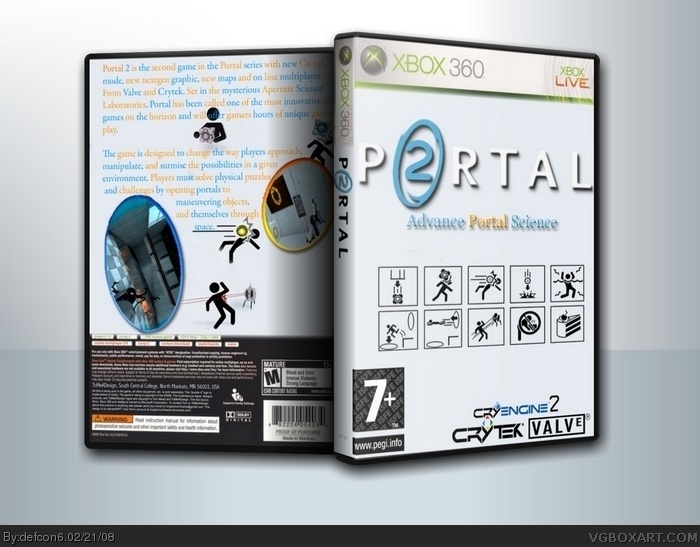
I have to say, though. The blue/orange alternations for the text is extremely unappealing, and really ruins it. The cover would also be leaps and bounds better without the "Advance Portal Science" (Which should be "advanced," not "advance" unless it's supposed to be a verb, not an adjective.) underneath the logo.
 Portal Box Cover Comments
My second cover. thx Saint for help :D
[ Reply ]
Crytek and Valve it's not good =( no, not good... (
[ Reply ]
It reminds me of mine.
I have to say, though. The blue/orange alternations for the text is extremely unappealing, and really ruins it. The cover would also be leaps and bounds better without the "Advance Portal Science" (Which should be "advanced," not "advance" unless it's supposed to be a verb, not an adjective.) underneath the logo.
[ Reply ]
I like the front cover except those Cry logos (c) Valve fanboy :D
[ Reply ]
I like the logo. But sorry man, that's about it. The PEGI logo is too big and it's an ESRB on the back. Crytek wouldn't make it either.
[ Reply ]
firstly this has been put under portal secondly ideas for update cryengine 3 logo and change the ERSB logo other than that good
Edited at 1 decade ago
[ Reply ]
#6, A bit late on all three boxes you posted on.
[ Reply ]