#6, ya I'll be fixing the spelling errors soon (or I could leave it there and make it seem like he was typing in a hurry and didn't have time for grammar =P). I was thinking of using a color scheme and I think I could pull it off, but that would need me to redo the whole back with a different art. so I don't think I'll be trying to change anything major like that soon.
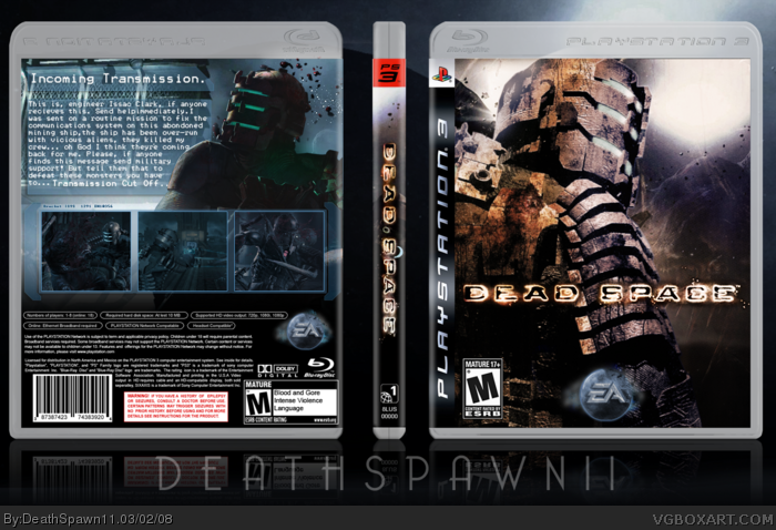
Excellent stuff DS11. Considering the limited images for this one -- you done good! As mentioned love the EA logo.. and the back turned out well (from last I saw it in WIP).. I guess the brightness isn't too bad as you covered it up with the screenshots, although I still preferred a darker back for the scary/spooky-ness of the game itself. ;)
Full view looks a little funky. The image on the front doesn't size up fully to the temp and it looks like the spine design (heh heh) bleeds out from the spine itself.
 Dead Space Box Cover Comments
yay, finished. cred to Jason for the magazine (I scanned it), and Techne for the temp. will be posting kit in LK resource thread soon.
[ Reply ]
Just don't say anything, just fav+!
[ Reply ]
please.
[ Reply ]
That EA logo rocks as does this box.
[ Reply ]
Those scans are HELLA sexy...
[ Reply ]
that's great. i love that EA logo.
only thing...to me, i would like it if the cover had a bluer scheme to match the back, or the back was more orange/brown.
and also a couple spelling errors i believe, and a space is needed between two words.
[ Reply ]
great it's just great. +fav
[ Reply ]
#6, ya I'll be fixing the spelling errors soon (or I could leave it there and make it seem like he was typing in a hurry and didn't have time for grammar =P). I was thinking of using a color scheme and I think I could pull it off, but that would need me to redo the whole back with a different art. so I don't think I'll be trying to change anything major like that soon.
[ Reply ]
#8 - i think it would be better without the spelling errors, makes it more official.
and for the colour scheme..couldnt you just adjust the hue of the images to match better?
[ Reply ]
#9, I'm messing with the hue right now, nothing seems to be coming out too well =/
[ Reply ]
Excellent stuff DS11. Considering the limited images for this one -- you done good! As mentioned love the EA logo.. and the back turned out well (from last I saw it in WIP).. I guess the brightness isn't too bad as you covered it up with the screenshots, although I still preferred a darker back for the scary/spooky-ness of the game itself. ;)
[ Reply ]
Full view looks a little funky. The image on the front doesn't size up fully to the temp and it looks like the spine design (heh heh) bleeds out from the spine itself.
Gorgeous nonetheless.
[ Reply ]
Amazing, very professional looking :)
[ Reply ]
very nice!
[ Reply ]
wow...faved
[ Reply ]
thx for all the comments guys, I'll be updating this tomorrow and hopefully posting my kit then to.
[ Reply ]
Holy crap, this is perfect. fav.
[ Reply ]
*needs kit*
*like, now*
[ Reply ]
This too.
[ Reply ]