#10, Well, that's kind of what frenchboy did, and that got in the Hall... :|
And VGAddict, please don't submit boxes anymore until you start putting effort into them. Or at least send your WIPs to someone before you post them- Ladykiller's door is always open (figuratively); I'm sure he'd be glad to help you.
#12 it's too bad there isn't a nicer way to say that...
its not a terrible box, but they're right, a little more effort and a little less wallpaper. but i guess we all had to start somewhere, right? (please fix the nintendo logo. it's supposed to be red and the inside is supposed to be white)
It's all right. I like the colors and images but I have criticisms. It's goofy that Mario looks as if he's delivering the SMG logo and that logo is small. A new arrangement of characters might help you improve upon these things.
Also the SMG logo is a bit choppy, the Nintendo logo looks stretched and there's no white in it.

 Super Mario Galaxy Box Cover Comments
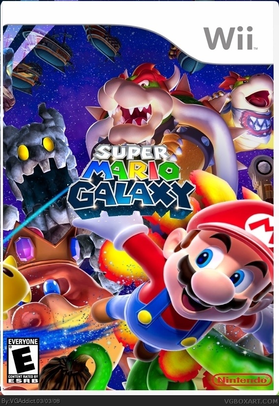
Please comment. I think its my best box ever!!
Credit to Crayonman for template
Edited at 1 decade ago
[ Reply ]
Great Editing And Love the design of bowser and baby bowser i love it all the trail and its in my favs and 10/10
[ Reply ]
it is your best but nintendo logo is bad and everything seems TOO close up. Smg logo also bad and small
[ Reply ]
thanks for the comments guys
Edited at 1 decade ago
[ Reply ]
Thinking about it i might make a little something for u too add to this and your other boxes
[ Reply ]
#5, what is it?
[ Reply ]
I like it, the logo seems kinda small, and a better Nintendo logo would be good.
[ Reply ]
it looks nice but its jus a zoomed in pic u fround online. but what realys bad is the pic extending the template
[ Reply ]
#8, no i made the box all on my own except the template
[ Reply ]
Please, all you did was put a render of Mario and some logos on this: link and stuck it under a template.
Edited at 1 decade ago
[ Reply ]
#10, well almost all of it
[ Reply ]
#10, Well, that's kind of what frenchboy did, and that got in the Hall... :|
And VGAddict, please don't submit boxes anymore until you start putting effort into them. Or at least send your WIPs to someone before you post them- Ladykiller's door is always open (figuratively); I'm sure he'd be glad to help you.
[ Reply ]
#12, ok ill do that for my later boxes. Thanks
[ Reply ]
#12 it's too bad there isn't a nicer way to say that...
its not a terrible box, but they're right, a little more effort and a little less wallpaper. but i guess we all had to start somewhere, right? (please fix the nintendo logo. it's supposed to be red and the inside is supposed to be white)
[ Reply ]
#10, I'm sure he knows how he made his own box so you need to make comments more helpful.
[ Reply ]
#14, #15, how do you like the box though?
[ Reply ]
It's all right. I like the colors and images but I have criticisms. It's goofy that Mario looks as if he's delivering the SMG logo and that logo is small. A new arrangement of characters might help you improve upon these things.
Also the SMG logo is a bit choppy, the Nintendo logo looks stretched and there's no white in it.
[ Reply ]
I think you of all people would know that there isn't really any rearranging you can do with that art.
[ Reply ]
i like it theres a lot going on to look at fave from me!
[ Reply ]