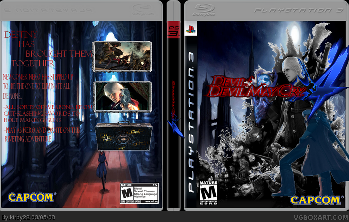
Well...
-A bunch of stuff is sticking over the template
-A lot of white stuff around the black stuff around Nero
-There's an extra logo sticking out from behind Nero
-I can see a bunch of black around the logo, and all the letters are transparent
-Dante is blue-ish, and he's just floating there
-The spine logo is going past the spine
-The back pic is really stretched
-The back text looks wierd (All stretched and in capitals)
-No copyright info on back
#3, Oldest excuse in the book. Seriously, no offense, but why would you want to make your box look worse than it should be? I have nothing more to add on to Star89er's post.
#4 i thought the logo twice made it look cool. the pics are SUPPOSED to stick out of the temp, the text came in caps letters nothing i can do about it and personally i like it, the pic with the white stuff around the black stuff around nero is how it came, like i said, idont know how to blend,and lastly letters are supposed to be transparent. but the copyright info i understand.
 Devil May Cry 4 Box Cover Comments
my newest box.
And since nobody visited my WIP thread, I just posted it.
I purposley did the logo twice.
Credit to Star89er for template, creative uncut and google for artwork, and ninty for screenborders.
Im trying to figure out how to blend. Also, i need to know how to reflect.
edit: please dont let this die...
Edited at 1 decade ago
[ Reply ]
Well...
-A bunch of stuff is sticking over the template
-A lot of white stuff around the black stuff around Nero
-There's an extra logo sticking out from behind Nero
-I can see a bunch of black around the logo, and all the letters are transparent
-Dante is blue-ish, and he's just floating there
-The spine logo is going past the spine
-The back pic is really stretched
-The back text looks wierd (All stretched and in capitals)
-No copyright info on back
[ Reply ]
#2 damn!
im too tired to explain, but some of those problems are supposed to look like that.
Edited at 1 decade ago
[ Reply ]
#3, Oldest excuse in the book. Seriously, no offense, but why would you want to make your box look worse than it should be? I have nothing more to add on to Star89er's post.
[ Reply ]
#4 i thought the logo twice made it look cool. the pics are SUPPOSED to stick out of the temp, the text came in caps letters nothing i can do about it and personally i like it, the pic with the white stuff around the black stuff around nero is how it came, like i said, idont know how to blend,and lastly letters are supposed to be transparent. but the copyright info i understand.
I've never seen that as an excuse.
[ Reply ]
dude, sorry to say but this isn't that good. Especially the cuting out. I saw your PM. Go check yours in a few minutes (actually, give me 45 mins...)
[ Reply ]