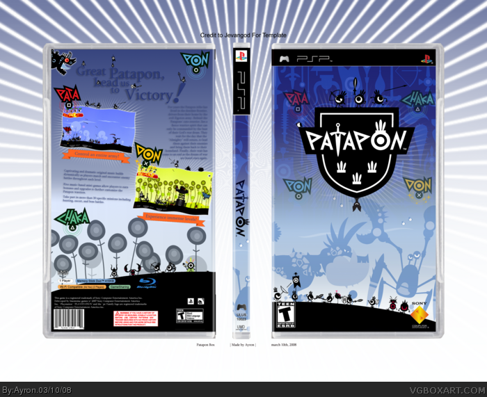
Looks good.. I like how the little fellows on the front as so small compared to previous box! Nice one!
I personally don't like the drop shadow on back tagline (prefer if text was darker - like the dark blue on front) and text right of the blue screenshot was widened to fill the gap between (I usually like text about 1cm away from images all sides ;))
-- Apart from that -- 9/10! ;)
#21, thanks for noticing the size of the patapons,as i wanted to keep the 'vibe'i got from research,and put it into this box.
and,9/10 but no fav,marker? disappointing ;)
 Patapon Box Cover Comments
That's freakin' sick!
[ Reply ]
Thanks alot #1 ;).
Ok, i normally don't make a PSP box.. but when i do, i go all out ;).
Here is an amazingly high-effort [ allthough it might not show ] Patapon box.
Mugglesman, eat your heart out ;)...
j/k. :P
[ Reply ]
You really let the images bleed out of the spine... :\
[ Reply ]
#3, ghhe i'll fix that right now.
[ Reply ]
That's beautiful...
[ Reply ]
Should I re-write the same comment I wrote on MARKER's "Heroes Edition" box or should I shut up and fav it ?
I hate you...
Edited at 1 decade ago
[ Reply ]
#6, i wuv you too! xD
-----------------------
update: fixed the spine!
-----------------------
[ Reply ]
Credit To ........
[ Reply ]
#8, please look about 50 pixels above the box,jevan ;)
[ Reply ]
I love it. The only thing is that the tagline could use a drop shadow or outline, it doesn't stick out so well.
[ Reply ]
#10, i know. that's exactly what i was planning on, to make the patapon more visible than the tagline .
As if it's a battlefield for them..
[ Reply ]
#9, Ohh sorry, I couldnt see it. Its small
[ Reply ]
i love it. It's simple and clean. 4.5/5
[ Reply ]
#13, may i ask what keeps you away from the big 5?
@jevan, lol.. np ;)
[ Reply ]
Wait... TEEN?
[ Reply ]
#15, yes.. it has mild violence in it.
[ Reply ]
Very nice, I suggest adding a slight drop shadow to the text on the back cover.
[ Reply ]
#17, .. hmm.. ok.. whatever'll work.
[ Reply ]
Yay, matching colors! Fav!
[ Reply ]
UPDATE! due to requests, drop shadows have been added to text. ;)
[ full-view plz ]
Edited at 1 decade ago
[ Reply ]
Looks good.. I like how the little fellows on the front as so small compared to previous box! Nice one!
I personally don't like the drop shadow on back tagline (prefer if text was darker - like the dark blue on front) and text right of the blue screenshot was widened to fill the gap between (I usually like text about 1cm away from images all sides ;))
-- Apart from that -- 9/10! ;)
Edited at 1 decade ago
[ Reply ]
#21, thanks for noticing the size of the patapons,as i wanted to keep the 'vibe'i got from research,and put it into this box.
and,9/10 but no fav,marker? disappointing ;)
[ Reply ]
#22, LOL -- okay, I've FAV you!
[ Reply ]
#23, LOL... classic ;)
[ Reply ]
#2 *eats heart* yummmm-*dies*
[ Reply ]
#25, lol. This is amazingly good. 12/10
[ Reply ]
Rofl. thanks #25-6
[ Reply ]
Can't believe I missed this. Awesome work, Ayron! ;)
[ Reply ]
#28, thanks mate ^.^"
[ Reply ]
Excellent!
Keep up the good work, mate ;)
[ Reply ]
#30, i will, thanks alot ^^
[ Reply ]
Love it! :)
[ Reply ]
Whoo, HoF!
[ Reply ]
I'd fav but I don't like the font choice :-\
[ Reply ]
#34, he doesn't have many fonts to work with and (I don't think) he can get new ones.
[ Reply ]