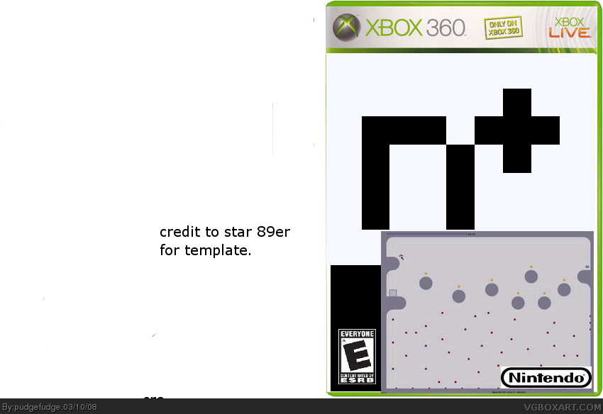
First of all its a Nintendo game on a 360 temp. You didn't cut out anything, you didn't credit the temp which we prefer, you placed it on a way to big of a background. I went to google and found a couple images in 2 mins or less.
Decent attempt, but firstly the nintendo logo still has the white around it, why is the nintendo logo even there in the first place instead of the Atari logo (the people who published it) or at least the microsoft logo. This is just a small issue on a decent cover.
 ]
]

 N+ Box Cover Comments
new boxart. enjoy.
Edited at 1 decade ago
[ Reply ]
I'm confused, what is this? Why is Nintendo the developer if it is on Xbox 360? Nintendo needs to be cut out better.
[ Reply ]
#2, I totaly agree, but otherwise, it looks nice, but you could need to show the player better.
[ Reply ]
Yeah I coudn't find a good enough picture
[ Reply ]
First of all its a Nintendo game on a 360 temp. You didn't cut out anything, you didn't credit the temp which we prefer, you placed it on a way to big of a background. I went to google and found a couple images in 2 mins or less.
link
could have used some of this link or link
I found a couple things so i have come to the conclusion you didn't try hard.
[ Reply ]
too plain, too hideous and the nintendo logo? Please, make it a bit more realistic and change the nintendo logo to Microsoft Xgen studios logo
[ Reply ]
Decent attempt, but firstly the nintendo logo still has the white around it, why is the nintendo logo even there in the first place instead of the Atari logo (the people who published it) or at least the microsoft logo. This is just a small issue on a decent cover.
[ Reply ]