It's not bad, but:
1. What's up with the Brettendo thing?
2. The reflection looks tacky.
3. A screen on the back says IGN.com.
4. There's a continuing white line under the description box.
5. The tagline is a bit cheesy and thoughtless.
Overall, I would say 4/5.
Very nice and simple like most DS BoxArts. I dont like the mario you have on the front, just my taste of course. Just some tips here
1. Maybe concider different screens.
2. yes #4 that tagline is not cool, but what do you expect from a DS game i guess
3. the "game experiense may change online" tag is possitioned incorrectly just a nit pick
#12, Of course I think this is effortless, you think I am blind?
You probably only spent maybe an hour and a half or less on this.
Whether or not it shows on my boxes, I sometimes spend days on them.
You're going to have to try harder than that -.-
#18, I honestly don't want to bicker with you so I will end this here. I see no kind of effort on this box, and with the screen that has the IGN.com logo on the bottom-right-hand-side of it, it proves my point as well! :) :D >:(
 Mario Kart DS Box Cover Comments
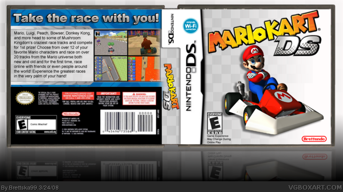
My Mario Kart DS cover, yes I know that's the unofficial logo but I prefer it more than the official one, and credit to Koopa for the temp, enjoy!
[ Reply ]
its awesome mate its so your best + fav 5/5
[ Reply ]
Very awesome!
[ Reply ]
It's not bad, but:
1. What's up with the Brettendo thing?
2. The reflection looks tacky.
3. A screen on the back says IGN.com.
4. There's a continuing white line under the description box.
5. The tagline is a bit cheesy and thoughtless.
Overall, I would say 4/5.
Edited at 1 decade ago
[ Reply ]
better than official artwork. +fav (Well, every mario kart ds box is better than official artwork!)
[ Reply ]
Very nice and simple like most DS BoxArts. I dont like the mario you have on the front, just my taste of course. Just some tips here
1. Maybe concider different screens.
2. yes #4 that tagline is not cool, but what do you expect from a DS game i guess
3. the "game experiense may change online" tag is possitioned incorrectly just a nit pick
In conclusion a 4/5 but a good box non the less.
[ Reply ]
Cool but a little too simple...
[ Reply ]
#7, simple boxes are the best boxes
[ Reply ]
#8, Thats fine, everybody got their own style
[ Reply ]
#8, depends really, it wouldnt really work on a game like Okami.
but with Mario kart it does good job 4/5
[ Reply ]
#8, effortless=/=simpleness.
Don't get them mixed up! ;)
[ Reply ]
#11, i understand the diffrence between effortless and simpleness, if you think this an effortless box your mistaken
[ Reply ]
#12 lol
it's always interesting to see new people diss veteran's boxes. hm...
anyway, another fantastic box from you. yes, fave.
[ Reply ]
#13, what, i ain't no vet!
[ Reply ]
#14, no you ain't.
[ Reply ]
I hate the official cover :( This on is cool and simple :p
Have you got any printable version ?
PS : For me, you're a vet :]
[ Reply ]
#12, Of course I think this is effortless, you think I am blind?
You probably only spent maybe an hour and a half or less on this.
Whether or not it shows on my boxes, I sometimes spend days on them.
You're going to have to try harder than that -.-
[ Reply ]
#17, an hour and a half? that's a long time, most of my boxes only take that long at most. how can this be effortless if he spent 1 hour+ on it?
[ Reply ]
#18, I honestly don't want to bicker with you so I will end this here. I see no kind of effort on this box, and with the screen that has the IGN.com logo on the bottom-right-hand-side of it, it proves my point as well! :) :D >:(
[ Reply ]
this kicks my box into a million pieces:P anyways this is good 5/5 +FAV
[ Reply ]
i like it! 5/5 +fav
[ Reply ]