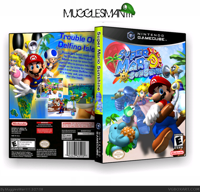
well, heres a quickie i came up with. i was wandering around with imandix again and came up with this. well i know its small but it looks a lil better in full view. hope you like. :P
EDIT: yea i know, most of it was renders , but there was nothing i could find to put on the sand, but thanks
#6 well theres nothing i can do about the size because of compression, but besides that what do you think bout it. oh and ayron eat all of the heart, dont leave one valve :)
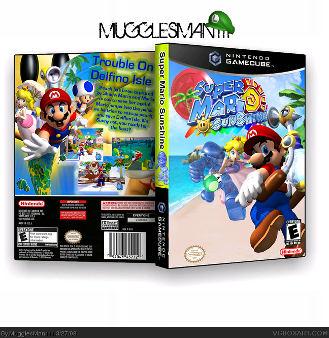
UPDATE: added drop shadows to the front. also, i fixed the back text with suggestions by DS11 hopefully this will help the front stand out and score me a few favs :P.
 Super Mario Sunshine Box Cover Comments
I love it bro! front seems a tad empty tho
Edited at 1 decade ago
[ Reply ]
well, heres a quickie i came up with. i was wandering around with imandix again and came up with this. well i know its small but it looks a lil better in full view. hope you like. :P
EDIT: yea i know, most of it was renders , but there was nothing i could find to put on the sand, but thanks
Edited at 1 decade ago
[ Reply ]
#2, my turn..
-eats heart- ;)
[ Reply ]
yeah seems too empty on the sand, and for that reason i cant fav,
other than that though its awsome.
EDIT: this would be good on the sand link
Edited at 1 decade ago
[ Reply ]
its nice
5/5
[ Reply ]
They could use shadows, and it's too small.
[ Reply ]
#6 well theres nothing i can do about the size because of compression, but besides that what do you think bout it. oh and ayron eat all of the heart, dont leave one valve :)
[ Reply ]
#7, well, they don't look right without shadows, but it's nice. 3.5/5
[ Reply ]
UPDATE: i added the pianta in the sand, and i think it looks better :). cred to ninty for the image. and sorry for no shadows.
[ Reply ]
nice
[ Reply ]
great box MM111. not your best but it's a whole lot better than mine.
[ Reply ]
I LOVE THE BOX.it's great.4.5/5 + fav
[ Reply ]
UPDATE: added drop shadows to the front. also, i fixed the back text with suggestions by DS11 hopefully this will help the front stand out and score me a few favs :P.
[ Reply ]
looks pretty good. the text on the back is touching the top though :O
[ Reply ]
sorry, it's a little too clustered for my liking. 3.4/5
[ Reply ]