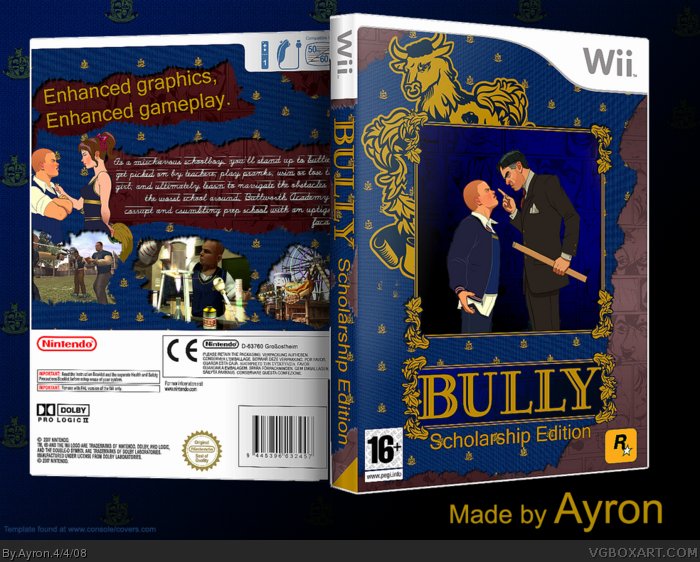
Most likely one of the most hard projects to put effort in, my Bully box has arrived.
printable'll be up soon--- imandix made a weird black line around text.
FULL VIEW PLEASE!
thanks to everyone for helping me in my WIP thread.
#5, i know, but it's the same on the official box >.>'.
About the text-- imandix kinda screwed it up.. no prob reading in printable[ which is most important,right ;)?]
The text still isn't easy to follow in the printable version. Also it looks like the Wii template has been cut like it was like on your Bleach box. Just trying to help.
I really like this a lot.
Like others have said, the text is a bit hard to read.
But everything else is great, and i'm loving the cloth-sort of effect you used. :D
+fav
 Bully: Scholarship Edition Box Cover Comments
Most likely one of the most hard projects to put effort in, my Bully box has arrived.
printable'll be up soon--- imandix made a weird black line around text.
FULL VIEW PLEASE!
thanks to everyone for helping me in my WIP thread.
[ Reply ]
Amazing. The text is pretty hard to read, though.
[ Reply ]
This is great. COlors and everything. Faved.
[ Reply ]
This one is great ;)
[ Reply ]
This is great, I'm struggling to read the text like TTT and I think you could have had a caption that's more relevant to the theme of the game.
[ Reply ]
#5, i know, but it's the same on the official box >.>'.
About the text-- imandix kinda screwed it up.. no prob reading in printable[ which is most important,right ;)?]
[ Reply ]
This is brilliant.
[ Reply ]
The text still isn't easy to follow in the printable version. Also it looks like the Wii template has been cut like it was like on your Bleach box. Just trying to help.
[ Reply ]
#8, i know, i know >.>'
stupid imandix ruins almost everything.
i'll make an update once.
[ Reply ]
This looks fantastic (except for the back text which I recognized only the word "bully") xD
Very original. +fav
[ Reply ]
#10, i don't see why you can't read it... i can read it just fine
:S.
thanks!
[ Reply ]
I really like this a lot.
Like others have said, the text is a bit hard to read.
But everything else is great, and i'm loving the cloth-sort of effect you used. :D
+fav
[ Reply ]
Really nice, one of your best, although I agree with E_G
[ Reply ]
Great box! Much better than the offical!
[ Reply ]
really nice but the Scholarship edition logo is really plain but tho 4.5/5
[ Reply ]
really nice!
[ Reply ]
Nice box :)
[ Reply ]
nice.... but the back is missing some information, or is it supposed to be like that?
[ Reply ]
+ Fav
[ Reply ]
w00t HoF !! =D
things are going uphill for me,lately ;).
[ yes, uphill isn't really a word..so? ]
[ Reply ]
I like it so much but if this was mine i would have made the back text black and made it look like it was writing in a notebook or journal.
[ Reply ]
#21, i tried that... it just didn't fit the torn-paper effect.
thanks though.
[ Reply ]