I wouldn't use the resident evil Umbrella text..as the Resident evil 5 text is a typer writer style font...and makes it more unique from the other custom covers...but I like your idea on the back..with the piece of paper and the blood stain...very like my one...other than that..is a good cover..well done..
 Resident Evil 5 Box Cover Comments
yet again anoter quickie, but i think this turned out realy well, any thoughts?
[ Reply ]
ok heres my update, enjoy! and would anyone say this is HoF material?
Edited at 1 decade ago
[ Reply ]
any comments at all
[ Reply ]
why is this being ignored?!!!!
[ Reply ]
wow i like it why isnt any 1 commenting fav
[ Reply ]
i have no idea, thanx man
[ Reply ]
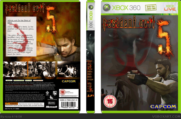
Back = Yes HoF
Front = No HoF
Front dont have the Resi feel make it more creepy
[ Reply ]
hmmm, thanx, u got any ideas for the front?
[ Reply ]
i was thinkin about adding a black rectangle and fading it out to make it darker
[ Reply ]
#7 would you say the front looks better now?
[ Reply ]
Use the critiques forum in the future.
And stop it with the flooding/bumping. My god.
[ Reply ]
sorry
[ Reply ]
I wouldn't use the resident evil Umbrella text..as the Resident evil 5 text is a typer writer style font...and makes it more unique from the other custom covers...but I like your idea on the back..with the piece of paper and the blood stain...very like my one...other than that..is a good cover..well done..
Greyfox™
[ Reply ]
really, thanx, i should check that out
[ Reply ]
removedthe biohazard logo, how is it now?
[ Reply ]
if anyone has any ideas on how to improve please tell me, and i'll fixe the capcom mixing with chris poblem, just noticed it lol
[ Reply ]
ideas to improve the back? im good with the front #19 yeah, i hust saw brekkstas and thought ill edit this
#18 shut up
Edited at 1 decade ago
[ Reply ]
#17, stfu
[ Reply ]
#17, Damn you still bumpin this box. Give it up already.
[ Reply ]