Hung from a wrecking ball to view a fashion show
I think you know me well, I think you know me well
I've been jumping over buildings,
I've been sleeping in the street
"Mr. Jones" will be right with you
if you would just have a seat
Well I'll meet you at the river
where we both can clear our heads
I think we would look great dead.
-----------
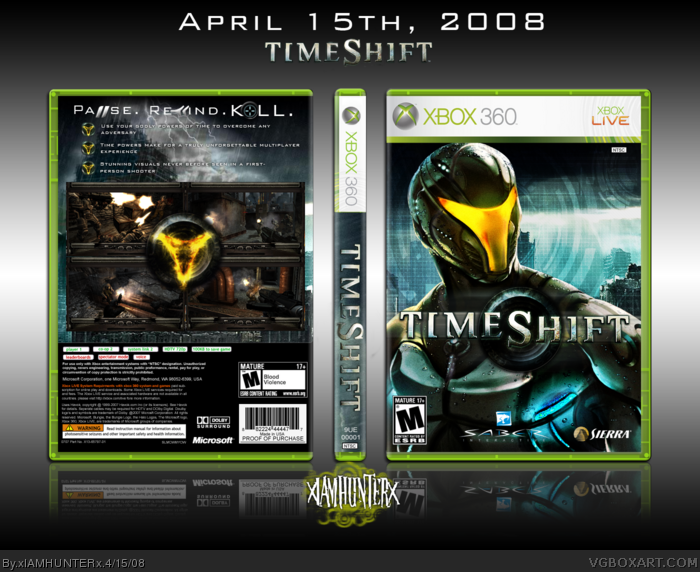
He Is Legend - The Seduction (The song that enabled me to finish this box - Thanks, Schyular)
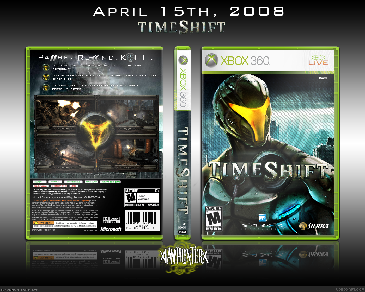
Started this one a while ago and have been working on it little by little ever since. Revamped it a few days ago - check the "abandon-o-rama" thread to see the first version.
I don't like this white glow or something. Box looks very uncontrast. I think it will looks much better without it. Oh, and I think that some features or comments under the screenshots will fit box.
Everything else is awsome. I love the front cover.
+ Fav
#3, Aren't they awesome? *hides in Schyular's ex-beard*
About the thing on the back, I dunno, it came like that. I took it off a hi-res scan of the official and shrunk it down a lot - like, a LOT - so I don't think there's anything I can do. *shrug*
Great. Though not as awsome as your other boxes, still it's good. The front is amazing, i really like the front. Back's a tad bit blurry, although quite interesting. Overall, the box is phenomenal. Great job, hunter. +fav
Nice one, great job, especially on the front.. like all the effects in the background. The main thing I don't really like is the choice of screen shots... as they are pretty much the same and dark. Nicer if a bit more varied with some close ups maybe. Don't like the bullets either.. as the yellow glow is a bit over used.. since it's on the guy's face on the front, and in dead centre on back as well.
Appreciate the crits, and I get what you're saying, but I felt that I needed to balance out the overpowering blue on the front, and since yellow was already present, I decided to use that.
 Timeshift Box Cover Comments
Hung from a wrecking ball to view a fashion show
I think you know me well, I think you know me well
I've been jumping over buildings,
I've been sleeping in the street
"Mr. Jones" will be right with you
if you would just have a seat
Well I'll meet you at the river
where we both can clear our heads
I think we would look great dead.
-----------
He Is Legend - The Seduction (The song that enabled me to finish this box - Thanks, Schyular)
Started this one a while ago and have been working on it little by little ever since. Revamped it a few days ago - check the "abandon-o-rama" thread to see the first version.
Creds to Ross for the temp as always.
[ Reply ]
I don't like this white glow or something. Box looks very uncontrast. I think it will looks much better without it. Oh, and I think that some features or comments under the screenshots will fit box.
Everything else is awsome. I love the front cover.
+ Fav
[ Reply ]
:O! i love he is legend!
---
box is good. the back logo thing in the middle seems kinda blurred or just bad quality to me.
[ Reply ]
#3, Aren't they awesome? *hides in Schyular's ex-beard*
About the thing on the back, I dunno, it came like that. I took it off a hi-res scan of the official and shrunk it down a lot - like, a LOT - so I don't think there's anything I can do. *shrug*
[ Reply ]
It cos of this damn white glowing shit... sorry, glow :)
AAAA, man, delete this glowing stuff! Please!
Edited at 1 decade ago
[ Reply ]
Alrighty, I fixed it. Don't get your panties in a wad. :P
Edited at 1 decade ago
[ Reply ]
Now it's perfect :D
- Fav
+ Fav
Edited at 1 decade ago
[ Reply ]
*pumps fist*
[ Reply ]
i like this <3
you spent your time well.
[ Reply ]
Thanks!
[ Reply ]
Oi
[ Reply ]
o.o
o.o
-.-
fav
[ Reply ]
Great. Though not as awsome as your other boxes, still it's good. The front is amazing, i really like the front. Back's a tad bit blurry, although quite interesting. Overall, the box is phenomenal. Great job, hunter. +fav
[ Reply ]
Nice one, great job, especially on the front.. like all the effects in the background. The main thing I don't really like is the choice of screen shots... as they are pretty much the same and dark. Nicer if a bit more varied with some close ups maybe. Don't like the bullets either.. as the yellow glow is a bit over used.. since it's on the guy's face on the front, and in dead centre on back as well.
[ Reply ]
Appreciate the crits, and I get what you're saying, but I felt that I needed to balance out the overpowering blue on the front, and since yellow was already present, I decided to use that.
Thanks though. ;)
[ Reply ]
There is absolutely nothing wrong with this box. I hope it makes the HOF.
[ Reply ]
:O
[ Reply ]
Looks great!
[ Reply ]
A FREAKING MAZING!
[ Reply ]
woooooow this is cooool!
fav from me
[ Reply ]
Gratz Hunter !
[ Reply ]
Wow, this is great, probably my fav from you.
[ Reply ]
Awesome! =D
[ Reply ]
O__________o
Gee whillikers, thanks!
[ Reply ]
congrats, you earned it ;)
[ Reply ]
Very nicely done.
[ Reply ]
looks great, and was this game any good btw? only like 5 people played it in the UK.
[ Reply ]
Wow, you were right Ryan, this DOES have the potential to be your best yet! :O
Grats on HoF, too.
Edited at 1 decade ago
[ Reply ]
#27, It was pretty cool.
[ Reply ]
sweet.
[ Reply ]
very very nice buddy , great job +fav , i no you dont need fav but hey i'm kind like th@ ;)
[ Reply ]
#27, It was pretty good. Story was meh but the gameplay was awesome. Could have used a bit more polishing.
I got faves from DMS and Gunslinger... I'm... I'm so happy... *sniff*
Edited at 1 decade ago
[ Reply ]
Congrats, man. :)
[ Reply ]
Thanks Al. ^__^
Get on AIM, nub.
Edited at 1 decade ago
[ Reply ]
#34, A.I.? He's a machine!? HA! I knew it! *dance*
Edited at 1 decade ago
[ Reply ]
#35, That doesn't even deserve a response.
[ Reply ]
Me like.
[ Reply ]
It's a nice box, but it looks as if the front is slightly wider (only by a few pixels) then the back.
[ Reply ]