alright people, this is my first box! :D This was originaly posted in the critiques forum, but it didn't get much attention... Positive feedback and tips please!
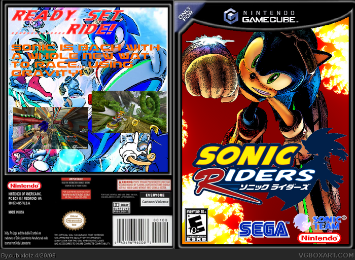
#2, the temp came with "only for", and i threw in the logo with japanese and english too, the sonic team logo hunter the hedgehog made, i thought it was kinda cool... geez, your just like hunter told me, you talk about right and wrong, you DON"T talk about how the box is put together, you DON"T talk about the art and other things used, and remember, this is my FIRST!
#4, i did get the get logo from him, and they're not dots, i used paint.net and used the ink sketch render, to create the effect, like the 1 guy did with his halo box, he did the same render to give him a grainy effect
Im sorry but that Sonic Team logo really does look awful.
Heres some tips how you can improve the box:
- Get an english logo
- Use screenshot borders
- The back description makes no sense, change it
- Spell the word 'Back' correctly
- Use a different template
Ok...1st box, pretty rough, so don't be too harsh people. You have a lot to work on, but there's a proper template, I can see effort, so keep trying and take everyone's tips.
#9 Dont bump your own boxes with mindless comments please. Alot of people have been banned recently because of that and I dont want you to be one of them considering you've just joined.
#11, Um, no he didn't. He was giving you a tip for the future, but if you're going to ignorant nobody is going to bother with you. Don't give yourself a bad rep.
 Sonic Riders Box Cover Comments
alright people, this is my first box! :D This was originaly posted in the critiques forum, but it didn't get much attention... Positive feedback and tips please!
[ Reply ]
Why is the logo japanese but your using an American ESRB logo?
Also that is not the correct Sonic Team logo
Also this game is not "only for" Gamecube.
[ Reply ]
#2, the temp came with "only for", and i threw in the logo with japanese and english too, the sonic team logo hunter the hedgehog made, i thought it was kinda cool... geez, your just like hunter told me, you talk about right and wrong, you DON"T talk about how the box is put together, you DON"T talk about the art and other things used, and remember, this is my FIRST!
[ Reply ]
did you get the sonic team logo from Hunter The Hedgehog? and i dont like the dots all over it, but good for a first!
Edited at 1 decade ago
[ Reply ]
#4, i did get the get logo from him, and they're not dots, i used paint.net and used the ink sketch render, to create the effect, like the 1 guy did with his halo box, he did the same render to give him a grainy effect
[ Reply ]
Im sorry but that Sonic Team logo really does look awful.
Heres some tips how you can improve the box:
- Get an english logo
- Use screenshot borders
- The back description makes no sense, change it
- Spell the word 'Back' correctly
- Use a different template
Overall 2/5
[ Reply ]
#5, i don't like the scratching effect!
[ Reply ]
Ok...1st box, pretty rough, so don't be too harsh people. You have a lot to work on, but there's a proper template, I can see effort, so keep trying and take everyone's tips.
[ Reply ]
ok
[ Reply ]
#9 Dont bump your own boxes with mindless comments please. Alot of people have been banned recently because of that and I dont want you to be one of them considering you've just joined.
[ Reply ]
#10, i was responding to #8, and, what you did right now, was really what you told me NOT to do! So ha!
[ Reply ]
#11, Um, no he didn't. He was giving you a tip for the future, but if you're going to ignorant nobody is going to bother with you. Don't give yourself a bad rep.
[ Reply ]
#12, i've read hths box comments, and this Cerium guy was giving him a bad time, whether the box was good or not
[ Reply ]
the fronts awsome! the back.... not so good
[ Reply ]