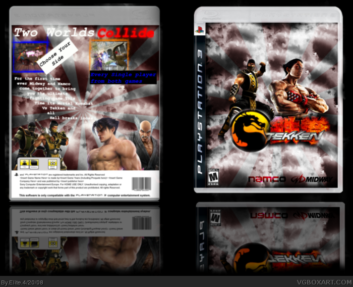
Make the MK guy at the front and MK Guys at the back a bit bigger and make the front MK guy like back to back with Kazuya. Use some different fonts and borders for the back. 3.9/5 And, it's namco bandai. This should under satire, it'll never happen in eternity.
midway hard to read, and youve used two different scorpion renders, change the one on the front with liu kang, and kazuya to (devil)jin and use a parchment with fancy writing for the blurb info, and 'm' is too small, esrb-wise 7/10
 Mortal Kombat vs Tekken Box Cover Comments
This Is a MK Vs Tekken box I made, I worked on this a lot and I hope you guys like oh and Tekken FTW
[ Reply ]
Make the MK guy at the front and MK Guys at the back a bit bigger and make the front MK guy like back to back with Kazuya. Use some different fonts and borders for the back. 3.9/5 And, it's namco bandai. This should under satire, it'll never happen in eternity.
[ Reply ]
midway hard to read, and youve used two different scorpion renders, change the one on the front with liu kang, and kazuya to (devil)jin and use a parchment with fancy writing for the blurb info, and 'm' is too small, esrb-wise 7/10
[ Reply ]
The image quality isn't very sharp at all and you're using two different templates. It's ok but there's much room for improvement.
[ Reply ]
NIce front, not so nice back. By the way, Tekken would totally own!
[ Reply ]
needs a Vs. sign. more characters on front and back. Change from "M" rated to "T". Tekken games aren't "M" rated.
[ Reply ]
#6, mortal kombat oanes are tho
[ Reply ]