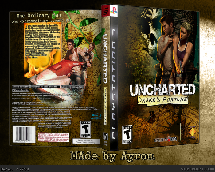
I notice a few problems. The ESRB on the back doesn't have descriptors, and the game doesn't have online. The Naughty Dog logo on the front is messed up as well. I also find the Sony logo to be hard to read.
The front is great. The back not so much. The text is so so so blurry. And one thing about the front. Is the bottom of that picture from divinci code (I think I spelled it right)
#4, dude, who cares? You know Imandix compresses image quality in 3D boxes. The text may be a bit blurry, but it's definitely not "so so so" blurry. Oh yeah, and you spelled "da Vinci" wrong.
At least Ayron puts more effort and creativity in his boxes than you do.
#6, woah! I never noticed that! Way to go Ayron!^^
#10, "At least Ayron puts more effort and creativity in his boxes than you do." You shouldn't act confrontational like that and you should respect his opinion.
#9, If people have problems with 3d---there's 2d..please bear that in mind.
Please people--no more inconsiderate comments such as 'i can't read the text'.
#13, I hope you were not trying to grind CC's gears. I know you've said annoying things to CC before and so has he.
My point is, that comment about him was likely to stir up trouble and I don't think you should have made it.
Still, really cool. The speeder thing on the back is a bit random, but I love the screenshots. Over all, a little too much unused space, but still gets a fav cuz you're on my favorite aut--I mean, it looks really cool :p
Nice idea with a different look to the cover. I like the front - real nice, although some work is required with the cloning on the compass on the bottom.
The jetski is a neat idea too... but I think there are lots of problems with the back. The screen shots in the leaves are a "NO NO" IMO -- I like to see proper screenshots (although they aren't in the printable.. why?) The font on the tagline is iffy, and the flame on the paper is good idea, but the text on the paper isn't effected by it, so looks weird. Back ESRB isn't full, Region 4? on spine and all the legal ##### hasn't been change. Plus too much black space on left. Fix all these, and it would be a cool box ;)
alright, first of all, the template should be fixed. PS3 boxes aren't that tall. Try and get that fixed. The text seems too squashed onto that little paper note thing, which kinda looks like melted cheese, btw. if you had stretched that horizontally, it would've filled more of the back and you could have more space to put the text and possibly make it more legible. the ESRB on the back needs one of those description boxes, and you need dev logos on the back. The sony logo and Naughty Dog logos are horribly rendered, and everything basically looks stretched and badly placed. The screenshots, while nicely hidden in those leaves, are hard to notice, and are hard to see due to the leaves being too small. The leaves don't fit into the background, btw. And i've no idea why Drake and Elena are just floating on their jet-ski thing. Come on, man. This is far below your standards. This looks rushed as hell, you people will put anything in the hall these days.
2.5/5, call it nitpicking, but this isn't as good as your other work.
 Uncharted: Drake's Fortune Box Cover Comments
I notice a few problems. The ESRB on the back doesn't have descriptors, and the game doesn't have online. The Naughty Dog logo on the front is messed up as well. I also find the Sony logo to be hard to read.
Edited at 1 decade ago
[ Reply ]
here's my udf box--had ALOT of probs >.<'
Printable for legible text,please.
-thanks to EVERYONE who helped me[ you know who you are]
screens are in the leaves.. they're hard to notice, but they're still there--after some examination.
#1--i'll update tomorrow.these are all small problems.
Edited at 1 decade ago
[ Reply ]
Purely awesome. To make it even more awesome, just follow #1's steps. ;)
Edited at 1 decade ago
[ Reply ]
The front is great. The back not so much. The text is so so so blurry. And one thing about the front. Is the bottom of that picture from divinci code (I think I spelled it right)
[ Reply ]
It's good but it looks like Imandix compressed the image quality too much, screenshots would be nice.
It looks like they've got one of those hi-tech flying jet-skis on the back. ;)
[ Reply ]
#5, screenshots are in the leaves.
[ Reply ]
#4, No
#5,may i refer you to the printable as this is only a display for the 'real' box---the printable.
[ Reply ]
#7, the printable doesn't have a Naughty Dog logo. >_>
Oh well
[ Reply ]
Then I think the screenshots are too small and subtle. I looked at the printable one but I'm wondering why you made it 3D, it's much worse.
[ Reply ]
#4, dude, who cares? You know Imandix compresses image quality in 3D boxes. The text may be a bit blurry, but it's definitely not "so so so" blurry. Oh yeah, and you spelled "da Vinci" wrong.
At least Ayron puts more effort and creativity in his boxes than you do.
#6, woah! I never noticed that! Way to go Ayron!^^
[ Reply ]
#10, "At least Ayron puts more effort and creativity in his boxes than you do." You shouldn't act confrontational like that and you should respect his opinion.
Edited at 1 decade ago
[ Reply ]
#9, If people have problems with 3d---there's 2d..please bear that in mind.
Please people--no more inconsiderate comments such as 'i can't read the text'.
[ Reply ]
I liked it better in the forums. >__>
#10, Weren't you leaving?
It was so nice here without you...
[ Reply ]
#13, I hope you were not trying to grind CC's gears. I know you've said annoying things to CC before and so has he.
My point is, that comment about him was likely to stir up trouble and I don't think you should have made it.
[ Reply ]
#10, Wat the hell is your problem. I faved the damn box. I love it. Only problem was the text. So like E_G said respect my opinion.
And also I think I might agree with xIAMHUNTERx on this one. With your attitude that is.
Edited at 1 decade ago
[ Reply ]
looks pretty special edition, nice
[ Reply ]
looks really sweet but i dislike the unofficial template.
[ Reply ]
Is it just me of is the printable different? o.O
Still, really cool. The speeder thing on the back is a bit random, but I love the screenshots. Over all, a little too much unused space, but still gets a fav cuz you're on my favorite aut--I mean, it looks really cool :p
[ Reply ]
#18, Yeah there is no spine or naughty dog logo and the text looks terrible.
Whats with the #### all over the game requirements and stuff.
Edited at 1 decade ago
[ Reply ]
Great one :D
+ Fav
Edited at 1 decade ago
[ Reply ]
Nice idea with a different look to the cover. I like the front - real nice, although some work is required with the cloning on the compass on the bottom.
The jetski is a neat idea too... but I think there are lots of problems with the back. The screen shots in the leaves are a "NO NO" IMO -- I like to see proper screenshots (although they aren't in the printable.. why?) The font on the tagline is iffy, and the flame on the paper is good idea, but the text on the paper isn't effected by it, so looks weird. Back ESRB isn't full, Region 4? on spine and all the legal ##### hasn't been change. Plus too much black space on left. Fix all these, and it would be a cool box ;)
[ Reply ]
alright, first of all, the template should be fixed. PS3 boxes aren't that tall. Try and get that fixed. The text seems too squashed onto that little paper note thing, which kinda looks like melted cheese, btw. if you had stretched that horizontally, it would've filled more of the back and you could have more space to put the text and possibly make it more legible. the ESRB on the back needs one of those description boxes, and you need dev logos on the back. The sony logo and Naughty Dog logos are horribly rendered, and everything basically looks stretched and badly placed. The screenshots, while nicely hidden in those leaves, are hard to notice, and are hard to see due to the leaves being too small. The leaves don't fit into the background, btw. And i've no idea why Drake and Elena are just floating on their jet-ski thing. Come on, man. This is far below your standards. This looks rushed as hell, you people will put anything in the hall these days.
2.5/5, call it nitpicking, but this isn't as good as your other work.
[ Reply ]
It looks good besides the things that were already noted. But I don't really like the fire on the back. It looks really unrealistic.
[ Reply ]
Wowsers
[ Reply ]