For DS11's comp against Kirbylore (will post link)
Credit to: Numero for screen borders, TTT and Dersnap for critique, official box for back template info =P
EDIT: Sorry for posting two boxes in one day, don't take me for a n00b xD
#8, I did? I just gave you a few pointers on AIM, not that much. Anyways, I like it. However, I hate the God of War font on the back. Change it, and I'll fave
#9, I agree that the color is weird, but I think the font works. A texture and a darker red probably would have been better.
#10, I believe you mean #9 ;) Thanks a lot :)
#11, Thanks :D
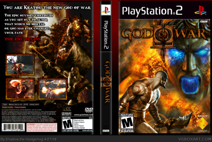
 God of War II Box Cover Comments
For DS11's comp against Kirbylore (will post link)
Credit to: Numero for screen borders, TTT and Dersnap for critique, official box for back template info =P
EDIT: Sorry for posting two boxes in one day, don't take me for a n00b xD
Edited at 1 decade ago
[ Reply ]
wow!
[ Reply ]
#2, Thank you :D
[ Reply ]
I love the front but the back could get more work. there's not too much text and there is a huge blank space too. For now 3/5
[ Reply ]
#4, I don't see it as a blank space, but thanks for taking the time to critique :)
[ Reply ]
There's no blank space. I like it.
[ Reply ]
#4, I don't see any blank space either.
Great box.
[ Reply ]
OMG, so sorry. DrDoomsday helped the most on this. Credit to him ;)
[ Reply ]
#8, I did? I just gave you a few pointers on AIM, not that much. Anyways, I like it. However, I hate the God of War font on the back. Change it, and I'll fave
[ Reply ]
@#8, I think the GoW font suits perfectly, they even use that on the official covers.
I think this is your best yet Shadow. You've come a long way. :)
[ Reply ]
Looks awesome
[ Reply ]
#9, I agree that the color is weird, but I think the font works. A texture and a darker red probably would have been better.
#10, I believe you mean #9 ;) Thanks a lot :)
#11, Thanks :D
Edited at 1 decade ago
[ Reply ]
amazing
[ Reply ]
Its very cool, I'm impressed.
[ Reply ]
ahh, I chalenge I see :)
[ Reply ]
Thanks guys :)
[ Reply ]