um. . . so. . . a game went from Xbox to Dreamcast? thats awkward. anyways, on the box. back is very messy. i can hardly read some parts. the front is blurry. VERY blurry. fix these minor things and it will be a great box! :D
I was working on a jet set radio sequel as well, my might finish it if I get into the mood. You should made the sequel for JSRF, it would make more sense than for sequel to a game already with a sequel.
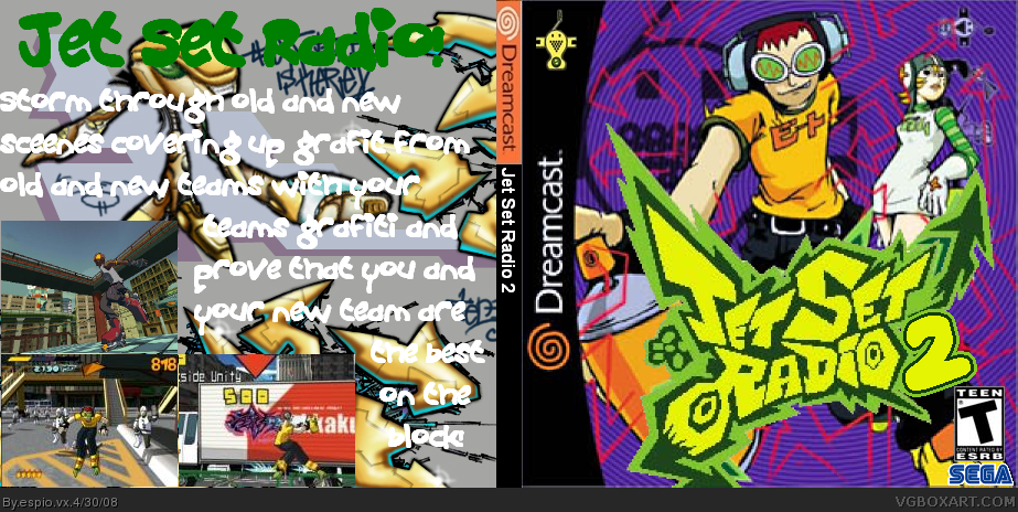
I think the white font would is better than that pink font, but the back is really busy, maybe fade out the background on the back, and move the screenshots all to the bottom, and add borders, then center the font more.
#12, it's empty, there's no template, the screenshots are in the wrong place and it just sort of ruins the whole feel of the box. trust me, get rid of it. :)

 Jet Set Radio 2 Box Cover Comments
Jet Set Radio 2!
Due to a post mentioning that everyone has forgotten Jet Set Radio, I decided to make a box on Jet Set Radio 2. What do you think?
Edited at 1 decade ago
[ Reply ]
um. . . so. . . a game went from Xbox to Dreamcast? thats awkward. anyways, on the box. back is very messy. i can hardly read some parts. the front is blurry. VERY blurry. fix these minor things and it will be a great box! :D
[ Reply ]
#2, no, it was the other way round i think.
[ Reply ]
serious? well, um. . . this is awkward, hehe. . . um. . . so. . . ahem. . . *runs away*
[ Reply ]
#3, You don't just think you know because a friend of mine has it for dreamcast. yay!
#2, First bit was wrong(look above) but I will try to improve the front as it is blurry, yes.
Everyone, I've changed the back so it's clearer (I realise it's not perfect). I think I might have to put the text in a box.
Edited at 1 decade ago
[ Reply ]
I was working on a jet set radio sequel as well, my might finish it if I get into the mood. You should made the sequel for JSRF, it would make more sense than for sequel to a game already with a sequel.
I think the white font would is better than that pink font, but the back is really busy, maybe fade out the background on the back, and move the screenshots all to the bottom, and add borders, then center the font more.
[ Reply ]
The text *has bean* improved!
*(Talking of "has bean"s, my hasbean feels much better after this improvement but I still need to fix the blury front)*
[ Reply ]
#7, to be quite honest, i think you should lose the back, it just dont look right.
[ Reply ]
#8, I will not give up on the back!
[ Reply ]
#8, i agree
[ Reply ]
#9, it just needs to go, it ruins it, otherwise its great, it'll gat more faves if you lose the back, and i'll be one of them.
[ Reply ]
#11, Well what's wrong with the back?
Edited at 1 decade ago
[ Reply ]
#12, it's empty, there's no template, the screenshots are in the wrong place and it just sort of ruins the whole feel of the box. trust me, get rid of it. :)
[ Reply ]
What is a "hasbean"?
[ Reply ]
#14, it is from, Dr. robotniks mean bean machine.
[ Reply ]
Is the front the official with a 2 added to it?
[ Reply ]
OK. No back image!
Edited at 1 decade ago
[ Reply ]
YEa this is the official front from the original Jet Grind Radio from the Dreamcast. I still have this game.
[ Reply ]
#18, yes it is. . . v.v
[ Reply ]
#18, Jet Grind Radio? WTF!
[ Reply ]
nice!
[ Reply ]
wow
[ Reply ]
#20, Jet Grind Radio is the american version.
[ Reply ]
#20, jet grind radio is the american one.
EDIT: #23, yeah! XD
Edited at 1 decade ago
[ Reply ]
#18, OH YEAH!!! cover this up NOW!
[ Reply ]