well, i can't say i'm so impressed with this :/ but it was fun to make. i didn't include the actual third game because its not on ps2 or out yet. credit to HalfSwiss/Vengeance/TTT for respective parts :P
This is actually pretty good. I just think it should have at least a few screens on the back (if you can find a way to fit them), I think all parts of crypto should be behind the border on the front, and I think the THQ logo shouldn't be so close to the border; it looks rather odd. Other than that, this gets an 8/10 from me.
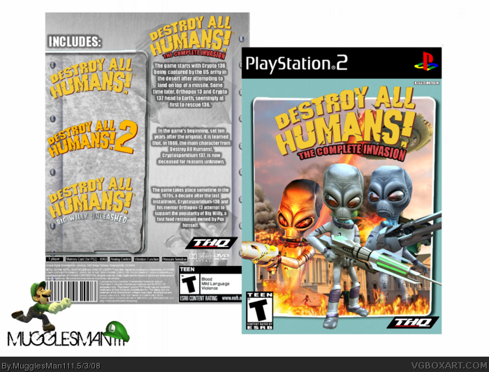
well i got the blue from a wallpaper that i edited. well thanks guys. i guessi kinda wanted to make the cryptos look like they were in and out at the same time. i guess this didn't turn out so well.. *shrug*
On the left side of the back, where the logos are, you could fade in screeshots behind the logos. You can have a screen from the fist behin the logo for the first, a screenshot from Big Willy under the Big Willy logo, etc. Just an idea.
 Destroy All Humans! The Complete Invasion Box Cover Comments
well, i can't say i'm so impressed with this :/ but it was fun to make. i didn't include the actual third game because its not on ps2 or out yet. credit to HalfSwiss/Vengeance/TTT for respective parts :P
[ Reply ]
Sorry but I'm not that impressed with it either.
[ Reply ]
I think the Crypto on the front would look better faded in like the others.
[ Reply ]
;0 wow... thats Awesome....
*Pees pants*
fav ;)
[ Reply ]
kind of a weird blue color on the front, but the overall box looks sweet.
[ Reply ]
This is actually pretty good. I just think it should have at least a few screens on the back (if you can find a way to fit them), I think all parts of crypto should be behind the border on the front, and I think the THQ logo shouldn't be so close to the border; it looks rather odd. Other than that, this gets an 8/10 from me.
Edited at 1 decade ago
[ Reply ]
well i got the blue from a wallpaper that i edited. well thanks guys. i guessi kinda wanted to make the cryptos look like they were in and out at the same time. i guess this didn't turn out so well.. *shrug*
[ Reply ]
Im really not too keen on the blue border on the front. Sorry.
The logo does look pretty sweet though.
[ Reply ]
ugh....i'm losin my touch. i guess i'll take a break.
[ Reply ]
That's beautiful. +Fav
I came up with the name.
[ Reply ]
#10 thanks man. :_
[ Reply ]
On the left side of the back, where the logos are, you could fade in screeshots behind the logos. You can have a screen from the fist behin the logo for the first, a screenshot from Big Willy under the Big Willy logo, etc. Just an idea.
Edited at 1 decade ago
[ Reply ]
Cool idea. I don't really like the back though, coming from you, I'm a little disappointed.
[ Reply ]
That expression that Luigi is making makes me wanna say,
OOOOOHHHHH MY BUTT!
[ Reply ]
#14 umm.? XD
[ Reply ]
good work
[ Reply ]
#14, I got a funny idea...you know that render of Paper Mario with the hammer? Yeah... >_>
[ Reply ]
Sweet work, Nick. ^^
[ Reply ]
very good nice box!!!
[ Reply ]
looks ok.
[ Reply ]
#20 hey look, i tried. didn't turn out so great. sorry guys.
[ Reply ]
Do you reckon you could add "Path of the Furon" to this? And maybe costumes from the other games?
[ Reply ]
Add a case to it.
[ Reply ]