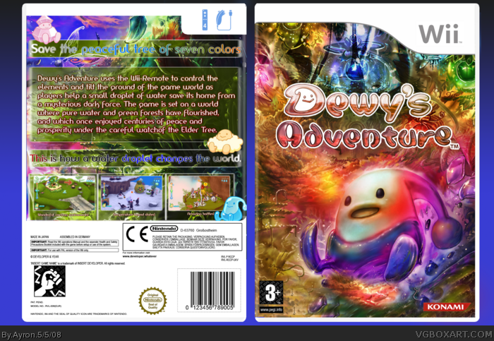
Welcome to my latest box, and trying another back lay-out..
This was a fun project to do.. with all the happy colors and editing..
Credit to adfd for template!
Looks good.. bright and colourful. Like another box (E_G?), I would have used a more "FAT" font for the back, but all in all - cool box. OH, prefer if you filled in all the legal stuff on the back -- doesn't look good with "insert game name" etc. all over the back ;)
I think there is just one small blemish on the front cover (on the bottom left hand next to the PEGI rating, there is banding and the image being repeated is noticeable - just blending/smudging or clone tooling carefully could fix it though).
But I like this, it has a more moodier and warmer color than the other dewy boxes, which have softer bluish colors.
#7, thanks for noticing-- i'll be sure to fix that.
Oh, and Dan,,[ it's ok if i call you that,right? :P ]-- could you please search exactly WHAT bothers you? i would love to try and fix it?
Anyway, I've realised what it is. I feel that the tagline should not be confined in a box, and maybe the summary too. If you're able to fix that, I'll have no qualms faving. (:
I don't like it. The contrast and brightness are messed up which is unappealing. I'm guessing you were trying to be different here but it doesn't work I'm afraid because it doesn't suit the game. The back feels way too full up because the artwork hasn't got enough space to breath which is a shame and the text underneath the screenshots is way too small.
#19, ok,well sure. i respect that [once more/..?] i was indeed trying to be different, and i thought the moody colors suited the game pretty good,myself.. i also thought there wasn't a real 'need'for the artwork to 'breathe', which isn't what i was trying to reach with the back at all.
#20, This is such a bright and upbeat game, a moody color scheme is pretty inappropriate. Also I don't understand why you would want to cover up so much of the artwork on the back. You could have at least got rid of some of the text.
Well it's your choice so excuse me if you think I'm being harsh but some of the design choices here don't make any sense to me.
 Dewy's Adventure Box Cover Comments
Welcome to my latest box, and trying another back lay-out..
This was a fun project to do.. with all the happy colors and editing..
Credit to adfd for template!
so, may i present to you:
Dewy's adventure!
[ Reply ]
someone said i would fall in love with boxes on this site. and i just have, it. is. AWESOME!!! +fav.
[ Reply ]
Not really a great time to post so early but hey the box is awsome and kicks ass.
[ Reply ]
nice and shiny oooo very well done ;D
[ Reply ]
Looks good.. bright and colourful. Like another box (E_G?), I would have used a more "FAT" font for the back, but all in all - cool box. OH, prefer if you filled in all the legal stuff on the back -- doesn't look good with "insert game name" etc. all over the back ;)
[ Reply ]
Watching this makes me think I'm on drugs... and that's a good thing.
[ Reply ]
I think there is just one small blemish on the front cover (on the bottom left hand next to the PEGI rating, there is banding and the image being repeated is noticeable - just blending/smudging or clone tooling carefully could fix it though).
But I like this, it has a more moodier and warmer color than the other dewy boxes, which have softer bluish colors.
[ Reply ]
I absolutely adore the front, but there's something about the back that turns me off. (It's not the font =P)
[ Reply ]
Exactly what Dan said o.o
[ Reply ]
Great. Well, now I can't make my Dewy box for another few weeks. =P
[ Reply ]
Extremely Stylish San.
[ Reply ]
#7, thanks for noticing-- i'll be sure to fix that.
Oh, and Dan,,[ it's ok if i call you that,right? :P ]-- could you please search exactly WHAT bothers you? i would love to try and fix it?
Thanks everyone =]
[ Reply ]
#12, It's okay, Sander :D
Anyway, I've realised what it is. I feel that the tagline should not be confined in a box, and maybe the summary too. If you're able to fix that, I'll have no qualms faving. (:
[ Reply ]
#13, i'll make an update, and pm it to you. ok?
Anyone else that agrees with that statement,please tell me so-- maybe i'll make an update with that.
[ Reply ]
the colors...there's a lot of 'em
but that's a good thing for this game lol.
nice box dude ^_^
[ Reply ]
Clean and colourful :)
[ Reply ]
:- )
[ Reply ]
Thanks #15-17,, appreciate it ^^'
Yes steven, you're right.. i wás going for a colorful box this time.. and i think i pulled it off neatly ;)
[ Reply ]
I don't like it. The contrast and brightness are messed up which is unappealing. I'm guessing you were trying to be different here but it doesn't work I'm afraid because it doesn't suit the game. The back feels way too full up because the artwork hasn't got enough space to breath which is a shame and the text underneath the screenshots is way too small.
[ Reply ]
#19, ok,well sure. i respect that [once more/..?] i was indeed trying to be different, and i thought the moody colors suited the game pretty good,myself.. i also thought there wasn't a real 'need'for the artwork to 'breathe', which isn't what i was trying to reach with the back at all.
[ Reply ]
It's cute ^_^
[ Reply ]
I love it. Great job, Ayron.
[ Reply ]
Very awesome! Love the colors. :]
[ Reply ]
#20, This is such a bright and upbeat game, a moody color scheme is pretty inappropriate. Also I don't understand why you would want to cover up so much of the artwork on the back. You could have at least got rid of some of the text.
Well it's your choice so excuse me if you think I'm being harsh but some of the design choices here don't make any sense to me.
[ Reply ]