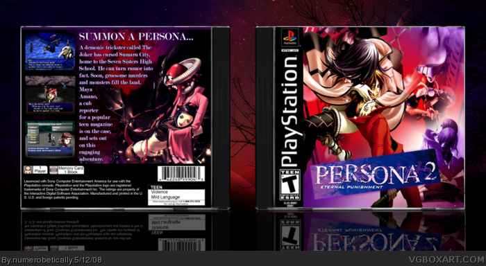
[ Box updated on May 13th, 2008 ] [ original ]
 Persona 2: Eternal Punishment Box Cover Comments
Comment on numerobetically's Persona 2: Eternal Punishment Box Art / Cover.
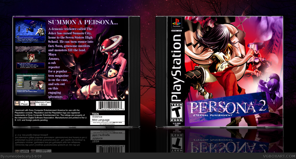
[ Box updated on May 13th, 2008 ] [ original ]
Comment on numerobetically's Persona 2: Eternal Punishment Box Art / Cover.
I hate you. jk fav.
EDIT: First!
Edited at 1 decade ago
[ Reply ]
Sooo... a special thanks to Venom, without whom I would never have thought to make this box.
I was trying for something different here, experimenting a bit with my style and blending and whatnot. Oh, and text wrapping.
Enjoy.
[ Reply ]
It's pretty hard to tell what's going on at first, but I like it. Good job, Nikki.
[ Reply ]
#2, really?? blaker just made this box the other day.....nice box though.
[ Reply ]
#3 Yeah I know. The first thing I wanted people to see was the title and the two biggest characters, then the two that are smaller and kind of purple, then the last image in the back. But it's up to you how your eyes work lol =P
#4 Did he? I noticed the title was already there when I submitted the box, but I didn't know who else had do it. I searched to make sure there weren't a lot of these and I didn't click the link (seeing the number was 1 was enough for me). I'll have to check it out.
[ Reply ]
love the front, the back is sweet to =)
Edited at 1 decade ago
[ Reply ]
Legendary.
[ Reply ]
I love it besides the text on the back but plus fav
[ Reply ]
#2, =)
[ Reply ]
Looks awesome, love the colours :) !
+fav
[ Reply ]
The is eye catching, I love the purplness of it.
[ Reply ]
Looks very nice. Don't like the text on the back.. I think I mentioned this on someone else's box, you really shouldn't have less than 2-3 words on a line IMO. Apart from that... looks good.
[ Reply ]
Agreed with MARKER about the back text, everything else is great. I love the style. :)
[ Reply ]
To be honest, I was a little pissy about the text. But I really, REALLY, wanted to use that render on the back. So I had to make it work. I agree with you, but there was nothing I could do about it unless I made the text way smaller.
Thanks for the faves and comments everybody.
[ Reply ]
#14, You know...the text doesn't always have to wrap.
The same thing can be said about filling up every nook and cranny of a box.
[ Reply ]
=P
You suck (jk). That's just how this one turned out. The box I'm working on now is a bit simpler.
[ Reply ]
Okay, I have an update. It's not much different. But I moved the one purple render of the robot-looking-thing. I can't remember the name for it. Anyway, I noticed something was overlapping it so I did a little erasing and nudging. Let me know what you think (if you want).
[ Reply ]
I know you did this forever ago, but I didn't notice you did this. This is a beautiful box for this game, one of my fav PS1 games. Do you have any kind of good resource for art for this game? I have trouble finding some good quality art for this one. Please PM me if you do :)
[ Reply ]