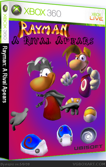
#2, Um...a rival. I don't really have a name but I'm trying to think of a good name cause I'm going to have his name on the back. Any help with a name (along with comments on the box)? Also credit to The Employer for the template.
Do you think Raydion is a good name for the new character?
5 comments(including 3 of my own). Anyone out there? Comments? Help with the name? Anything?
OMG! No one out there!
Front's good... pics on the back gotta be more in the center and the text is too big and is typed in a bad font for this... But you did a good job and every box you spent time at you can be proud of!
 Rayman: A Rival Apears Box Cover Comments
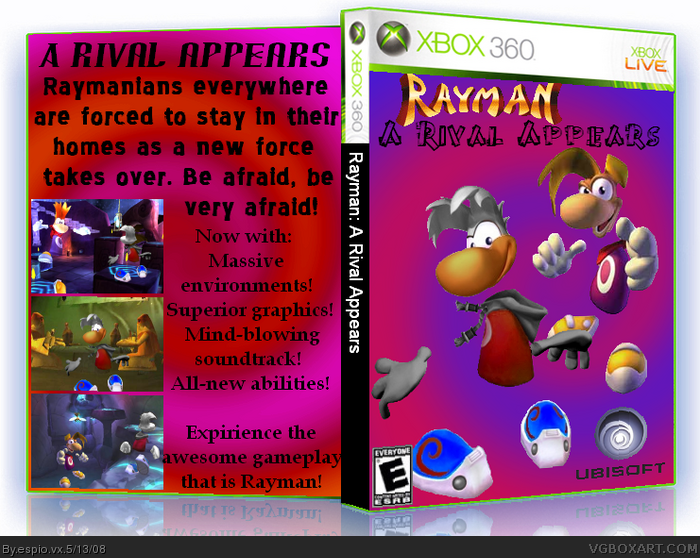
What do you think? I'm going to add a back later...
[ Reply ]
it's good but who is that clone.
Edited at 1 decade ago
[ Reply ]
ooh. no to the spine but otherwise sweet. what you doin up?
[ Reply ]
#2, Um...a rival. I don't really have a name but I'm trying to think of a good name cause I'm going to have his name on the back. Any help with a name (along with comments on the box)? Also credit to The Employer for the template.
[ Reply ]
Do you think Raydion is a good name for the new character?
5 comments(including 3 of my own). Anyone out there? Comments? Help with the name? Anything?
OMG! No one out there!
Edited at 1 decade ago
[ Reply ]
#5, check your PMs
[ Reply ]
#6, Raydian instead of Raydion. Um...I think Raydion sounds better.
What do you people out there think. Raydian, Raydion or something else?
2 thinks Raydion (me, zapshadowx).
1 thinks Raydian (Dark Matter).
#8 Thanks alot! Which name do you think I should have for the new character. Raydian, Raydion or something else?
Yey! A hundred veiws!
Um...Sorry. It appears that I spelt appears wrong. I spelt it with one P. It should have two P's.
Edited at 1 decade ago
[ Reply ]
THIS IS THE BEST SUBTITLE FOR A GAME... EVER!!
[ Reply ]
#8, xD that was the most RANDOM thing i've read on the site
anyways, the box, could use some more work, and i think the 'rival' should have a little more of a difference to Rayman than just a recolor! :D
[ Reply ]
You spelled "Appears" wrong.
[ Reply ]
UPDATE!Now I've spelt appears right, added an ESRB logo and made a back! Yey!
#10, I mentioned that on #7. Fixed it on the update.
Edited at 1 decade ago
[ Reply ]
Edited at 1 decade ago
[ Reply ]
#12, Are you going to say something, or are you typeless with amazement (probably not)?
[ Reply ]
#5,raydion. cool
[ Reply ]
#5, No. I don't like that name.
...at all.
[ Reply ]
#15, which would you use, Radion or Radian?
[ Reply ]
#16, None. :|
#18, Radian.
Edited at 1 decade ago
[ Reply ]
#17, if you HAD to.
[ Reply ]
#18,Raydion.
Edited at 1 decade ago
[ Reply ]
w00t! i'm the 1st commenter on v3
anyways... i don't like the:
- back because...
- no system text (you know, the small print)
- text too big and plain
- screenshots aren't arranged well
- front because...
- the subtitle font doesn't work
- the rayman logo is too near the top
- box in general because...
- u got a 3d template and put 2d stuff on it
- get a 2d temp, put the stuff on and if u still want 3d, THEN make it 3d
i like the box because:
- you recoloured rayman well
other:
nice reflection.
yeah, that was quite a long post
but...
yeah.
so...
bye.
BErtieISgreAT
Currently working on...
BOXES:
Comp box
^
(can't say what it is)
LOGOS:
None atm... =]
Edited at 1 decade ago
[ Reply ]
Front's good... pics on the back gotta be more in the center and the text is too big and is typed in a bad font for this... But you did a good job and every box you spent time at you can be proud of!
[ Reply ]