#2,4,7, see, this is why we don't respect you guys. You don't even know anything about what your obsesed about.....
but anyway, I really don't like the temp, the big thing on top is really distracting, and also mario isn't cut out the BEST, but it's OK... The title could also use some work, but overall, it's mildly funny. Not worth a fav, but it's alright.
#13, i couldn't find one of nintendo, but i could use one, thanks for the fav, and #12, the big thing at the top is the blu-ray thing. but glad you like it.
#15 Why did you need to bump your own box with such a ridiculous question?! (and you didnt even say please.) if you want a Nintendo logo, use the resource forum OR use google?

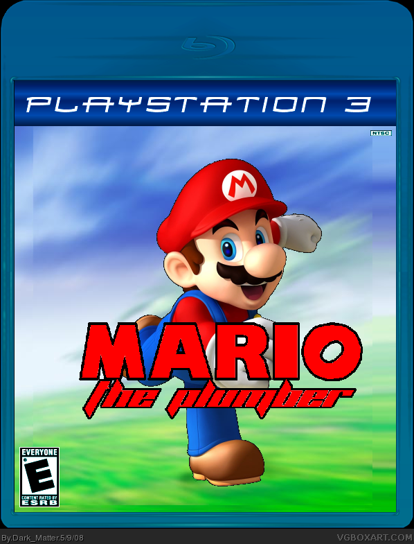
 Mario The Plumber Box Cover Comments
worked hard, credit;
temp: me (link)
Logo: me
Background: SonicStyle
render: Planetrenders
3rd box, dont think i'll ever post my first.
[ Reply ]
good. but don't post it on PS3.make it nintendo. and it looks like sonic rivals.2/3 edit: i don't get the joke
Edited at 1 decade ago
[ Reply ]
#2, does it?
EDIT: do you know what this is a parody of?
Edited at 1 decade ago
[ Reply ]
#3,no.sonic rivals?
Edited at 1 decade ago
[ Reply ]
WHY DID STEAK FAV THIS?!
[ Reply ]
#5, coz he liked it?
#4, Sonic The Hedgehog 2006.
[ Reply ]
You should put a plunger in or something just to show that it's really Mario the plumber.
[ Reply ]
#7, cant you guess that by the fact that mario is on the front..?
[ Reply ]
#6,oh.funny
[ Reply ]
#9, thank you. :)
[ Reply ]
wow, it's already getting shunned. :(
[ Reply ]
#2,4,7, see, this is why we don't respect you guys. You don't even know anything about what your obsesed about.....
but anyway, I really don't like the temp, the big thing on top is really distracting, and also mario isn't cut out the BEST, but it's OK... The title could also use some work, but overall, it's mildly funny. Not worth a fav, but it's alright.
[ Reply ]
lol, i get it, it's a joke on sonic. needs a dev logo.
Edited at 1 decade ago
[ Reply ]
#13, i couldn't find one of nintendo, but i could use one, thanks for the fav, and #12, the big thing at the top is the blu-ray thing. but glad you like it.
Edited at 1 decade ago
[ Reply ]
anyone have a nintendo logo i could use?
[ Reply ]
#15 Why did you need to bump your own box with such a ridiculous question?! (and you didnt even say please.) if you want a Nintendo logo, use the resource forum OR use google?
[ Reply ]
#16, i couldnt edit my last post. and i cant find one on google.
[ Reply ]
#17, Are you Fecking serious... ?
link
you just wanted to bump
dont.
[ Reply ]
#18 LOL
we can always rely on Ninty for a humerous comment ^_^
[ Reply ]
#18, a hi res one i mean, but that was pretty damn funny. ^_^
Edited at 1 decade ago
[ Reply ]
#20, The second one's a thousand pixels wide.
Nice try, though.
[ Reply ]
#20 Why does it matter if the Nintendo logo is high quality or not?! Its not like the rest of the box is of any quality :P
[ Reply ]
#20, Also why would you need it high res ? it'd be the size of
'' T____H____I____S ''
Edited at 1 decade ago
[ Reply ]
#22, you dont like me do you? anyway, updated.
[ Reply ]
Temp is good but what did you change
[ Reply ]
#25, thanx, i made that, i added a dev logo, you know, nintendo.
[ Reply ]
Hate the template. Also the ESRB logo is blueish. Mario is choppy. The sky is weird at the sides. Whats with the NTSC?
Edited at 1 decade ago
[ Reply ]
he made the temp himself, thats why i faved.
[ Reply ]
BAD BOX my brother can do better
[ Reply ]
#29, *stifles laughter*
[ Reply ]